The Affiliate Link Placements Readers Actually Click

Knowing where to place affiliate links for clicks matters more than the basic advice you already know: one link near the top, one at the end, maybe one in the middle for good measure. You’ve done that on every post, and some links still get clicked ten times more than others on the same page. That gap isn’t luck. It’s placement relative to how a reader’s eyes actually move, not placement relative to a content template.

This article is about closing that gap without adding a single new link or driving a single new visitor. You already have the content and the traffic. What’s left on the table is where you’re putting the thing you want clicked.

Why click location beats link count

Adding more links rarely raises click-through once you’re past two or three per page. Readers stop noticing links as distinct objects when there are too many of them, and the ones that do get clicked are almost always the ones sitting in a spot the reader was already looking at, not the ones placed because a guide said “add a link every 300 words.”

Count matters far less than position. A single link placed where a reader’s attention and decision both happen to land will outperform five links scattered through paragraphs the reader skims past. If your click-through rate is flat despite decent traffic, the fix usually isn’t writing more, it’s moving what you’ve already written.

How readers actually scan a page before they click anything

Readers don’t read top to bottom. Eye-tracking studies on web pages consistently show a pattern shaped like the letter F: a strong horizontal scan across the top, a shorter horizontal scan partway down, then a vertical drift down the left side as the reader skips through headings and bolded text looking for something worth stopping for.

A close-up over-the-shoulder shot of a laptop screen glowing in a dim room, with a blurred reflection of a reader's eyes caught mid-motion sweeping across the top of the page and then down the left-hand margin, suggesting a fast F-shaped scanning path rather than a steady top-to-bottom read.

That means the top of your post and your subheadings carry a disproportionate amount of attention, while the back half of long paragraphs gets almost none. A link buried in the fourth sentence of a dense paragraph is sitting in the part of the page the reader’s eyes already left behind. A link sitting right after a subheading, or inside a short paragraph near one, is sitting exactly where the scan pattern stops to check for relevance.

This is the piece most placement advice skips. It’s not about early versus late. It’s about matching the link to where the F-pattern actually puts the reader’s eyes on that specific page.

The first-screen link: when it helps and when it looks desperate

A link above the fold can work, but only when the reader arrived already knowing roughly what they want. Someone who searched “best [product] for beginners” and lands on your comparison post has intent before they read a word. A first-screen link that confirms “yes, this is the roundup you’re looking for, here’s the top pick” meets that intent directly.

The same link looks desperate on a post the reader arrived at to learn something, not to buy something. If your opening paragraphs are still establishing the problem, a link right there reads as “buy this” before you’ve earned the click. The reader hasn’t formed intent yet, and a link that assumes they have tends to get ignored or, worse, makes the rest of the post feel like a sales pitch they now distrust.

The test isn’t position, it’s whether the reader’s intent at that point in the page already matches what the link offers. If it does, put it there. If it doesn’t, wait.

Comparison tables and buttons: the highest-click real estate on the page

If your post has a comparison table, that table is almost certainly your best-performing link location, and it’s worth checking your numbers to confirm it before you move anything else. Tables compress a decision into a scannable format: the reader can see options, prices, and standout features side by side without reading a word of surrounding text. A button or link inside a table row gets clicked because the decision already happened in the three seconds the reader spent scanning that row.

A bright, clean desk scene with a tablet propped up showing a row of product options side by side, a hand reaching out to tap a bold, clearly colored button on one row while the other rows sit in plain text, highlighting the contrast between a styled button and an ordinary link.

This is also why a bare text link inside a table often underperforms a clearly styled button in the same spot. The table has already done the work of narrowing the choice. A button confirms “this is the action,” while a plain link half-hidden in a cell forces the reader to go looking for what to click next, and some of them won’t bother.

If you don’t have a comparison table and your content is naturally comparative, that’s worth fixing before you fiddle with link position elsewhere. It’s one of the few structural changes that reliably moves click-through on its own.

In-line text links versus image links versus standalone buttons

Each of these three formats earns attention differently, and conflating them is where a lot of placement advice goes wrong.

Three small product photos arranged on a light wooden surface, one with a visible link icon overlay, next to a strip of plain underlined text on an index card and a single glossy raised button-shaped object, representing three distinct link formats side by side.

  • In-line text links work best mid-content, where the reader is still reading for information and a link that extends the sentence feels natural rather than interruptive. They convert lower per-impression than buttons but get seen more often because they sit inside text the reader is already reading.

  • Image links (a product photo linked to the offer) work well right after you’ve described what the thing looks like or does, because the image answers a question the reader just formed. They underperform badly when placed with no supporting text nearby, since the reader has no reason to click an image they don’t yet understand.

  • Standalone buttons work as decision points, not reading points. They belong at the end of a section once you’ve made an argument, not in the middle of making it. A button dropped mid-argument interrupts the reasoning before the reader is convinced.

The mistake isn’t using the wrong format, it’s using the same format everywhere. A page that’s all text links or all buttons wastes the specific strength each one has.

What changes on mobile scroll behavior

Mobile readers scroll faster and scan less horizontally, since there’s no second column or sidebar competing for attention. That collapses the F-pattern into something closer to a straight vertical line, which means subheadings and the first line under them matter even more on mobile than on desktop.

A person's hand holding a smartphone one-handed while sitting on a couch in warm evening light, thumb resting naturally near the bottom of the glowing screen as the page scrolls in a fast vertical blur.

It also means a link that depends on being seen alongside something else, like a sidebar call-out or a two-column comparison, often doesn’t translate to mobile at all. If a meaningful share of your traffic is on mobile, which for most affiliate content it is, check that your highest-value links aren’t sitting inside layout elements that collapse, hide, or get pushed below several screens of scrolling once the page renders on a phone.

Thumb position matters too. Buttons placed where a thumb naturally rests at the bottom of a screen get tapped more than ones requiring a reach to the top corner, which is a detail worth testing if your theme gives you that control.

Placing links by reader intent, not by position in the post

The most useful shift is to stop thinking in terms of “early,” “middle,” and “late,” and start thinking in terms of what the reader is trying to decide at each point in the post.

  • At the point where you’ve just answered “does this solve my problem,” a link lets the reader act on that answer immediately.

  • At the point where you’re comparing two or three options, a link or button on each option lets the reader choose without scrolling back up.

  • At the point where you’ve addressed the last objection or caveat, a closing link catches the reader who was close to convinced and needed exactly that reassurance.

Three links placed at those three intent points will usually outperform six links placed every few paragraphs regardless of what the reader is thinking at that moment. If you want the underlying structure for building content that creates these intent points deliberately rather than relying on them to show up naturally, how to write affiliate content that converts covers how to build a post around them from the first draft.

Testing placement changes without guessing

Repositioning links based on scan patterns is a reasonable starting point, but it’s still a hypothesis until you have numbers behind it. Change one placement at a time; if you move three links on the same post in the same week, you won’t know which change did anything.

Give each change enough traffic to produce a meaningful sample before judging it. A post that gets forty visits a week needs a month or more of data before a click-rate change means anything, not three days.

Keep a simple record of what you moved and when, even if it’s just a note in a spreadsheet: link, old position, new position, date changed. Without that, it’s easy to convince yourself a placement worked when traffic simply had a good week.

Where to go from here

Once you’ve repositioned your links based on where your readers’ attention and intent actually sit, the only way to know if it worked is to track clicks and conversions by placement rather than by page. The funnel tracking method in how to track affiliate sales through a funnel walks through setting that up so you can see which specific spot on the page is doing the work, instead of guessing from total pageviews alone.


How to Track Affiliate Sales For Every Stage of Your Funnel

If you want to know how to track affiliate sales through a funnel, start here: open your affiliate dashboard and you’ll see one number, sales, over a given date range. That number tells you whether you made money. It tells you nothing about why you didn’t make more of it.

Say you sent 2,000 visitors to a funnel last month and closed 8 sales. A 0.4% conversion rate. That figure alone doesn’t tell you whether your landing page failed to get opt-ins, your emails failed to get opened, or your emails got opened and clicked but the offer itself didn’t land. Those are three completely different problems with three completely different fixes, and a single dashboard number collapses all of them into one unhelpful percentage.

This is the setup for seeing each stage separately: landing page visit, opt-in, email click, affiliate link click, sale. Once you can see each one on its own, you stop guessing which part of the funnel is broken and start knowing.

Why your affiliate dashboard number hides more than it shows

An affiliate dashboard exists to tell the affiliate network one thing: how much it owes you. It was never built to diagnose your funnel. It shows you sales attributed to your affiliate links, sometimes clicks on those links, and that’s usually the end of it.

A dim home office at night, a laptop screen the only light source, showing one large glowing number alone on an otherwise blank dark screen, the rest of the desk in shadow.

Everything that happened before someone clicked your affiliate link is invisible from inside that dashboard. How many people landed on your page. How many opted in. How many opened your email. How many clicked through from the email before ever reaching the affiliate link. The dashboard starts the story in the middle and only shows you the ending.

That gap is where most wasted traffic lives. You can run a funnel for months, watch the sales number stay flat, and have no idea if the problem is your landing page, your lead magnet, your email sequence, or your offer. Each of those needs a different fix. Guessing wrong means you spend weeks rewriting emails when the real leak was on the landing page, or redesigning a landing page that was already converting fine.

Mapping your funnel into trackable stages before you tag anything

Before you touch a single tracking tool, write down the actual path a prospect takes through your funnel, in order. Most affiliate funnels look something like this:

  • Visits the landing page

  • Opts in with an email address

  • Receives a follow-up email

  • Clicks a link inside that email

  • Clicks the affiliate link

  • Buys

Your funnel might have more steps or fewer, but the principle is the same: each one is a gate, and prospects fall out at every gate. You can’t track what you haven’t mapped, so write your actual sequence down before anything else. If you’re not sure your landing page is doing its job at the first gate, the landing page elements that actually move your opt-in rate is worth a look once you can see the numbers behind it.

Once the stages are written down, decide what a “success” at each stage actually means in terms you can measure: a page view, a form submission, a click on a specific link, a tracked sale. Vague stages produce vague tracking. Specific stages produce numbers you can act on.

Setting up UTM parameters so each traffic source stays identifiable

A UTM parameter is a tag you add to the end of a URL that tells your analytics where a visitor came from and what they clicked. Without it, every visitor to your landing page looks identical in your reporting, whether they arrived from a YouTube description, a Pinterest pin, or a Facebook post.

A tagged URL looks like this: yourpage.com/?utm_source=youtube&utm_medium=video&utm_campaign=review2026. The source tells you the platform, the medium tells you the type of traffic, and the campaign tells you which specific piece of content or promotion sent the visitor. Use these three consistently and you can filter your traffic by any of them later.

A corkboard above a desk strung with colored string and small labeled tags in different colors, each tag tied to a different thread, representing separate traffic sources kept distinct, lit by warm desk-lamp light.

The part people get wrong is consistency. If you tag YouTube traffic as youtube in one campaign and yt in the next, your reports will treat them as two separate sources and split your data in half. Pick a naming convention before you start and write it down somewhere you’ll actually check, because the alternative is a reporting view fragmented across a dozen near-duplicate labels that never add back up to the real total.

Tag every link you put traffic behind: posts, pins, descriptions, bios, paid ads if you’re running them. This is the layer that tells you which traffic source is actually worth your time, separate from everything that happens once a visitor lands.

Using a link tracking tool to separate clicks from opt-ins from sales

UTM tags tell you where traffic came from. A link tracking tool tells you what that traffic did once it arrived, click by click, inside your own funnel rather than just at the landing page.

Most affiliate marketers only ever track one click: the final one, on the affiliate link itself, because that’s the one the network shows them. But if you route your affiliate link through a tracking tool instead of linking to it directly, you get a click count that’s separate from and prior to the sale count in your dashboard. That one change lets you compare clicks to sales and calculate your actual close rate on the offer, instead of assuming every sale came from roughly the same volume of clicks.

A clear glass funnel on a wooden table with colored marbles passing through it, visibly fewer marbles at each narrowing stage from top to bottom, backlit by soft window light.

The same logic applies further back. A tracking tool, or even built-in analytics on your landing page and email platform, can show you:

  • How many people saw the landing page

  • How many of those became opt-ins

  • How many opted-in subscribers clicked the link inside your email

  • How many of those clicks reached the affiliate link

  • How many of those became sales

Each of those is a separate, countable event. Once you have real numbers at each one, the single dashboard percentage turns into a chain of percentages, and chains show you exactly where the weak link is.

Connecting email click data to what happens after the opt-in

The opt-in is where most affiliate marketers stop measuring and start hoping. They know how many people joined the list. They know, eventually, how many people bought. What happens in between is a black box unless you deliberately light it up.

Your email platform almost certainly tracks open rates and click rates per email already. The piece worth setting up deliberately is tagging the links inside those emails with their own UTM parameters, separate from the ones on your landing page, so you can tell a landing page visit from an email click in your reporting even though both eventually lead to the same affiliate link.

This matters because it separates two very different problems. If your open rates are solid but your click rates inside the email are low, the email isn’t persuading people to act, even though it’s getting read. If your click rates are fine but almost nobody who clicks ends up at the affiliate link, something in the layout or the copy between the click and the offer is losing them. These look identical from the dashboard. They are not identical problems, and if you’re relying on your list to carry the funnel at all, it’s worth revisiting why affiliate marketers need an email list in the context of what that list is actually supposed to do at each stage, not just whether it exists.

Reading the full picture: finding the exact stage where people drop off

With UTM tags on your traffic, a link tracker on your clicks, and email data connected to what happens after the opt-in, you now have a number at every gate instead of one number at the end. Lay them out in sequence and calculate the percentage that survives each step:

A metal kitchen sieve held under running water, with a single visible crack letting a thin stream leak out the side while the rest of the water passes through normally, close-up with droplets catching light.

  • Landing page visits to opt-ins

  • Opt-ins to email clicks

  • Email clicks to affiliate link clicks

  • Affiliate link clicks to sales

Somewhere in that sequence, one percentage will drop sharply compared to the others. That’s your leak. Everything above that stage is working well enough to pass people through. Everything below it never gets the chance, because the people who would have converted further down never arrived in the first place.

This is also where you’ll start to notice patterns across traffic sources, not just across funnel stages. One source might send visitors who opt in at a strong rate but never click your emails. Another might send fewer opt-ins overall but a higher share of them buy. Those are two different kinds of traffic worth two different kinds of attention, and you’d never see the distinction from a single blended conversion number.

Turning a tracking leak into a specific fix instead of a guess

Once you know which gate is losing people, the fix becomes specific instead of speculative. A weak landing-page-to-opt-in rate usually points to the page itself: the headline, the offer, the form, or the trust signals around it. A weak opt-in-to-email-click rate usually points to the emails not following through on what the opt-in promised, which is worth checking against how to build a lead magnet that actually gets opened if the lead magnet is where that promise gets made. A weak click-to-sale rate, once clicks are confirmed to be reaching the affiliate link, usually points to the offer or the program itself rather than anything in your funnel.

That last distinction matters because it’s the one tracking makes possible and guessing doesn’t. Without stage-by-stage data, a low sale count looks like a funnel problem by default, and the instinct is to rebuild the funnel. With the data, you might find the funnel is doing its job perfectly and the actual issue is further upstream, inside the funnel’s automation and sequencing, which is worth a second look through how to automate affiliate sales funnel so it sells without you once the tracking tells you where to focus the automation work.

Tracking doesn’t fix a leaking funnel by itself. It tells you which part to fix first, so the next change you make is the one that actually matters instead of the one you happened to guess at.

Once tracking is in place and you can see where the funnel actually leaks, read What Is a Good Conversion Rate for Affiliate Marketing? to judge whether each stage’s numbers are actually a problem or within normal range.

How to Automate Affiliate Sales Funnel So It Sells Without You

A home office desk at morning light with a laptop open to an email inbox full of unread messages, a steaming coffee mug beside it, and a notepad with a half-finished to-do list, suggesting someone about to manually send another batch of emails.

Most affiliate marketers reach a point where the pieces exist. The landing page is live. The lead magnet is built. The list is growing. And then every email still goes out because someone sat down, opened their email tool, and clicked send.

That gap between having a funnel and running a funnel is where most income gets left on the table. The pieces are not the problem. The wiring is.

This article is about how to automate affiliate sales funnel steps that currently depend on you remembering to do them, so the sequence sells on its own schedule instead of yours.

What Actually Needs to Run Without You

Not everything in a funnel benefits from automation. Content creation, traffic generation, relationship building in a community, these still need a person behind them. What should run without you is anything that happens the same way every time a subscriber reaches a certain point.

If a new subscriber always gets the same welcome email, that’s automation work, not a task for you to repeat by hand. If someone who clicks an affiliate link but doesn’t buy always needs a follow-up three days later, that’s a rule, not a decision. Decisions need you. Rules don’t.

The test is simple: if you can write down the exact logic (“when X happens, send Y”), it belongs in automation. If the next step depends on judgment, reading the subscriber’s situation, or something you’d have to think about fresh each time, it stays manual for now.

Most marketers who are still sending everything by hand haven’t actually mapped which of their emails are rules and which are judgment calls. They just do all of it, every time, which is why the whole thing feels like a part-time job instead of a system.

Mapping the Path from Click to Commission

Before any automation goes in, write out the actual path a subscriber takes. Not the path you intended. The one that happens.

A typical path looks something like this:

A close-up of a handwritten notebook page covered in arrows, circled steps, and small sticky notes mapping out a subscriber's path from opt-in to purchase, a pen resting across the page under warm desk-lamp light.

  • Visitor lands on the opt-in page and gives their email for the lead magnet

  • Lead magnet delivery email arrives

  • Subscriber gets a series of emails building trust and providing value

  • Subscriber gets a recommendation with an affiliate link

  • Subscriber clicks, or doesn’t

  • Subscriber buys, or doesn’t

  • Subscriber either moves toward a next offer or sits on the list waiting for the next broadcast

Every arrow in that chain is a point where automation can take over. Every point where you currently decide “should I send something now” is a point where a trigger should be deciding instead.

Writing this out usually exposes a few steps nobody is managing at all. A subscriber clicks the affiliate link and nothing happens next unless you happen to notice and follow up. That subscriber just fell out of the funnel, and nobody was watching.

If your opt-in page or lead magnet aren’t pulling their weight in this chain, the automation won’t fix that. Worth checking your landing page elements and whether your lead magnet are converting before you spend time wiring up what happens after.

The Email Sequence That Does the Selling For You

A sequence that sells does three jobs, in order: it earns attention, it builds a reason to trust the recommendation, and it makes the offer at the point where trust is highest, not before.

A basic sequence that works for most affiliate funnels:

  1. Delivery email. Sends the lead magnet immediately. No selling here, just deliver what was promised and set expectations for what’s coming.

  2. Value email. Goes out a day or two later. Teaches something useful related to the lead magnet topic. No affiliate link yet.

  3. Story or context email. Explains the problem the product solves, in terms the subscriber recognizes from their own situation. Still no hard pitch.

  4. The offer email. Makes the recommendation directly, with the affiliate link, and a clear reason why this product solves the problem just described.

  5. Follow-up for non-openers or non-clickers. A shorter, different-angle email that doesn’t repeat the first pitch, it reframes it.

  6. Last call or urgency email, if the offer genuinely has a deadline or bonus. Skip this one if there’s no real reason for urgency; inventing false scarcity costs trust you can’t easily buy back.

This sequence runs on a timer once someone opts in. It does not need you to write a new one for every new subscriber. The content stays the same; what changes is who’s receiving it and when.

A laptop screen displaying a row of drafted emails arranged like a timeline, with a small desk calendar beside the keyboard showing a few days circled, soft natural light from a nearby window.

The actual writing of these emails follows the same logic as any affiliate content that sells: lead with the reader’s problem, not the product’s features. If that structure is unfamiliar, the same principles that make affiliate content convert apply inside an email just as much as on a page.

Tagging and Segmentation: Getting the Right Offer to the Right Subscriber

A sequence that sends the same five emails to everyone on the list treats a brand-new subscriber the same as someone who already bought through one of your links. That’s a mismatch, and it costs sales.

Tags solve this. A tag is just a label attached to a subscriber based on something they did: opened an email, clicked a specific link, bought through a specific offer, downloaded a specific lead magnet. Once a subscriber is tagged, you can build rules around that tag instead of guessing where they are in the funnel.

A corkboard with colored labels and index cards pinned into separate clusters, each card marked with a different colored sticker, representing subscribers sorted into distinct groups, lit by warm overhead light.

Practical tags worth setting up early:

  • Lead magnet source, so you know which opt-in brought them in and can tailor the first offer to match

  • Clicked offer A versus clicked offer B, so you don’t pitch something they already said no to by ignoring it

  • Purchased, so buyers stop getting the “have you considered this?” emails for a product they already own

  • Engaged versus cold, based on open and click activity over the last month or two, so your best content goes to people actually reading it

Segmentation means using those tags to split your list into groups and sending each group something that actually fits where they are. A subscriber tagged “purchased” for one affiliate product is a much better candidate for a related, complementary offer than someone who never opened an email in three weeks.

This is also where list quality starts to matter more than list size. A smaller, well-tagged list that gets the right offer at the right time will outperform a large untagged list every time, which connects directly to why owning your list matters more than chasing subscriber count.

Setting Up Triggers Instead of Sending Manually

A trigger is the thing that starts an automation without you touching it. Instead of you deciding “it’s been three days, I should follow up,” the system checks the condition itself and acts.

Common triggers worth setting up:

A row of dominoes on a desk with the first one just tipped over, mid-fall, each subsequent domino about to react, shot close with shallow depth of field.

  • Opt-in triggers the welcome sequence. The moment someone joins the list, the first email fires automatically.

  • Tag added triggers a new path. If someone gets tagged “clicked offer A” but not “purchased” within a set window, a follow-up sequence starts on its own.

  • No activity for X days triggers a re-engagement email. Subscribers who’ve gone quiet get a check-in instead of silently sitting on the list.

  • Purchase tag triggers a stop. Once someone’s tagged as a buyer, they’re automatically pulled out of the sequence still pitching that same product.

Most email platforms handle this through simple if-this-then-that logic: if tag equals X, wait Y days, then send Z. None of it requires custom code. It requires sitting down once, setting the conditions, and then trusting the system to run them.

The habit to break is checking in and manually deciding “should I send the follow-up now?” Once the trigger is set, that decision is made in advance, for every subscriber, consistently. That consistency is the entire point. A sequence sent on willpower sends later and later until it stops going out at all.

Where Automated Funnels Quietly Break Down

Automation doesn’t fail loudly. It fails quietly, by running exactly as configured while the configuration itself is slightly wrong.

A close-up of interlocking metal gears, most turning smoothly except one visibly rusted gear jammed among them, muted industrial lighting emphasizing the single flaw in an otherwise working mechanism.

A few common breakdowns:

  • Tags that never get removed. Someone buys, but the “hasn’t purchased” tag never clears, so they keep getting pitched a product they already own. This reads as inattentive at best.

  • Sequences with no exit condition. A subscriber who already clicked through and bought keeps receiving the same “have you seen this?” email because nothing told the sequence to stop for them specifically.

  • Dead links inside automated emails. An affiliate link that worked at setup can go stale months later, and because the sequence runs untouched, nobody notices until commissions quietly drop.

  • One sequence serving every lead magnet. If three different lead magnets all feed into one generic welcome series, subscribers get content that doesn’t match what they signed up for, and trust erodes before the sequence even gets to the offer.

  • Over-automation of judgment calls. Some situations, like a subscriber who replies with a direct question, genuinely need a human response. Automating that away reads as indifference, not efficiency.

The fix for all of these is the same: review the sequence periodically. Automated doesn’t mean unattended forever. It means it doesn’t need your attention daily. Set a reminder, perhaps monthly, to check tag logic, click-through rates at each stage, and whether links still resolve.

Testing the Sequence Before You Trust It With Traffic

Before sending real traffic into an automated funnel, run yourself through it. Opt in with a separate email address and watch what actually happens, not what you assume is set up.

Check specifically:

  • Does the delivery email arrive promptly with the right lead magnet attached?

  • Does each subsequent email arrive at the interval you set, not early, not late?

  • Do the tags apply correctly when you click a link or ignore one?

  • Does a purchase (or a simulated one, if the platform allows a test mode) correctly stop the pitching sequence?

  • Do the affiliate links actually go where they should?

It’s worth testing with a couple of different paths, not just the happy path where someone opens everything and clicks everything. Test what happens when a subscriber opens nothing for two weeks. Test what happens when they click but don’t buy. The sequence should have a sensible answer for each of those, not just the ideal case.

Once the mechanics check out, the only thing left to watch is whether the sequence actually converts, which ties back to knowing what a reasonable conversion rate looks like for your niche before you judge the funnel’s performance against the wrong benchmark.

A funnel that runs correctly but converts poorly is a content and offer problem. A funnel that converts poorly because a tag is misapplied or a sequence never stops is a wiring problem. Testing before traffic is how you tell the difference before it costs you money.

Map your own funnel this week: write down every step a subscriber takes from opt-in to purchase, then automate the first one that still relies on you clicking send.

Landing Page Elements That Actually Move Your Opt-in Rate

A clean, minimal landing page mockup shown on a laptop screen with a single headline, one short form field, and one button, lots of white space, no clutter, soft natural light on a desk.

If you want to know how to increase landing page opt-in rate, start here: a landing page has one job, which is to get the visitor to do the one thing you put them there to do. Not read your story, not admire your design, not learn everything about your lead magnet. Opt in. Everything on the page either moves a visitor toward that action or gets in the way of it, and most pages are quietly full of things that get in the way.

Three problems sabotage opt-in rates more than any others. The page asks for too much before it has earned anything. It gives the visitor more than one decision to make. And it looks fine on a desktop monitor but falls apart on the phone screen where most of your traffic actually lands. Fix those three and you’ve fixed the page. This is a build sheet for doing exactly that, element by element.

The one job a landing page has, and the three things that quietly sabotage it

Before you touch headlines or button copy, look at the page as a whole and ask what it’s actually asking the visitor to do. If the answer takes more than one sentence, the page is asking for too much.

The three sabotage points are worth naming plainly because they show up in almost every underperforming page:

  • Too much friction. Extra form fields, extra paragraphs, extra clicks between arrival and opt-in.

  • Too many decisions. A second offer, a navigation menu, a link to the blog, anything that competes with the one action you want.

  • Too little trust, too late. Nothing on the page tells the visitor why this is safe or worth thirty seconds, until it’s buried below a fold they never scroll to.

Everything below addresses one of these three.

Headline and subheadline: what earns the next three seconds of attention

A visitor decides whether to keep reading within the first few seconds. The headline’s job isn’t to be clever. Its job is to tell the visitor, immediately, what they get and who it’s for, so the next line has something to confirm.

A headline that describes a benefit in concrete terms outperforms one that describes a feeling. “Free checklist for pricing your first affiliate offer” tells a visitor exactly what’s waiting. “Finally, clarity on pricing” tells them nothing they can act on. Specificity is what makes a headline do its job; vagueness is what makes a visitor leave.

The subheadline’s job is different from the headline’s. Where the headline states the offer, the subheadline removes the one objection most likely to stop someone from opting in. That’s often a time objection (“takes five minutes to read”) or a relevance objection (“built for affiliates with no list yet”). Write the subheadline after you know what your visitor hesitates on, not before.

Keep both short. A headline that runs two lines on mobile has already lost some of its force before the visitor finishes reading it.

Form fields: why every extra one costs you opt-ins

Every field on a form is a small decision and a small amount of friction, and friction compounds. A visitor willing to give you an email address may not be willing to also give you a first name, a phone number, and an answer to “what’s your biggest challenge.” Each additional field is a chance for them to stop.

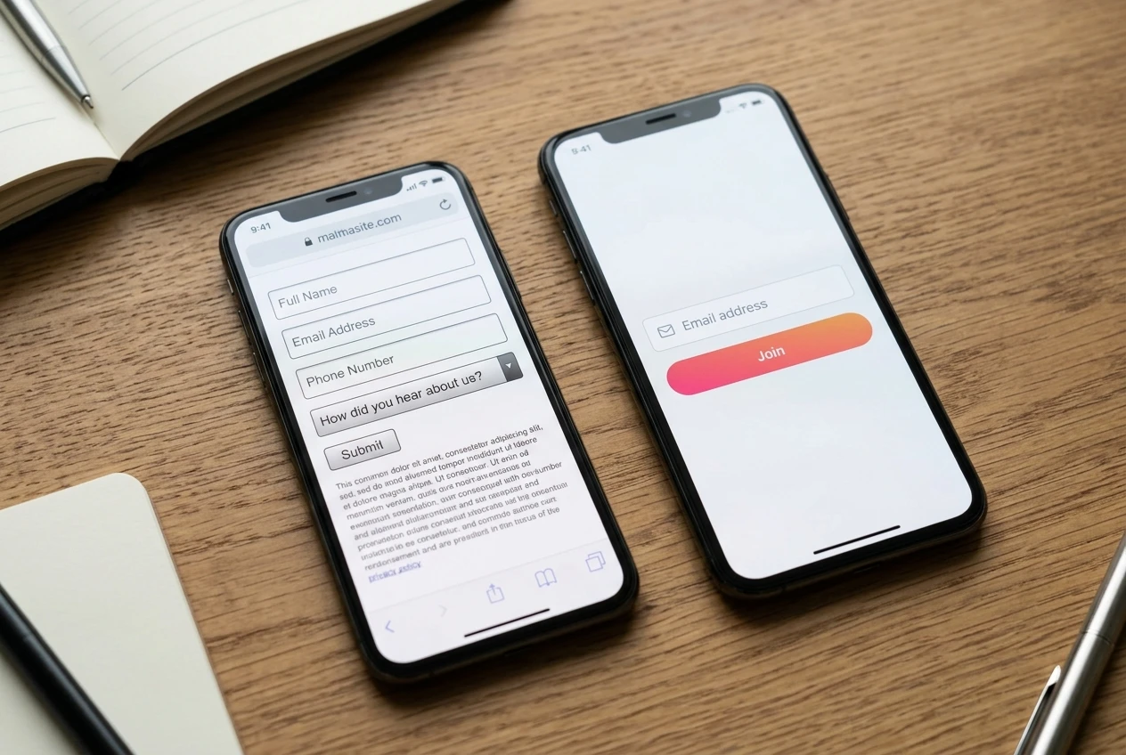
Side-by-side comparison of two opt-in forms on a smartphone screen: one cluttered with four fields (name, email, phone, dropdown), the other with just a single email field and a button, showing the stark visual contrast in simplicity.

If the only thing you need to deliver the lead magnet and start the relationship is an email address, ask for only the email address. Add a name field only if you have a specific, tested reason to personalize later emails and you’re confident the extra field is worth what it costs you in opt-ins. Don’t add fields because they might be useful someday. Add them when you have a current use for the data and no way around it.

This matters more on mobile than on desktop, because typing on a phone keyboard is slower and more error-prone than typing on a physical one. A two-field form that’s mildly annoying on desktop can be the difference between an opt-in and an abandoned page on mobile.

If you’re currently running a three or four field form and opt-ins feel low, cutting it down to email-only is one of the few changes on this list you can test in under an hour and expect to see move the number.

The single call-to-action rule, and why two competing offers halve both

A landing page should offer one action. Not one primary action with a secondary link to your blog, not one offer with a second offer below it for people who “aren’t ready yet.” One action, repeated as many times as the page needs it, never varied.

The reasoning is simple: every additional choice you give a visitor reduces the odds they take any single one of them. This isn’t a matter of taste, it’s a matter of attention. A visitor who has to decide between opting in now, reading more first, or checking out a related offer, is a visitor who has three things to think about instead of one. Most will resolve that by doing nothing at all.

A landing page mockup with two competing buttons of different colors and labels fighting for attention near the top, cluttered with a navigation bar and extra links, visually busy and split.

This means:

  • No navigation menu that lets visitors wander away from the page.

  • No second offer “in case this one isn’t for you.”

  • No link to your homepage, your about page, or your social profiles.

  • The button text should describe the same action every time it appears on the page, not a different phrase each time for variety.

If you want to test two different lead magnets or two different angles, that’s a job for two separate landing pages, not one page with two buttons. Run them separately and compare. A page with two competing calls to action doesn’t give you two chances to convert; it gives you one chance split in half.

Trust signals that work before you have testimonials or case studies

Most advice about trust signals assumes you already have testimonials, reviews, or a case study to show. If you’re early, you don’t have those yet, and that’s fine. There are trust signals that don’t depend on social proof.

A privacy line near the form, something as simple as a statement that the email address won’t be sold or spammed, removes a specific and common hesitation at the exact moment the visitor is deciding whether to type. It costs you one short sentence and it addresses a real objection directly.

Close-up of a landing page form with a short privacy reassurance line printed directly beneath the email field, clean typography, soft focus background, warm neutral tones suggesting trustworthiness.

Specificity itself functions as a trust signal. A lead magnet described in vague terms (“a free guide to affiliate success”) reads as generic and faintly suspicious. A lead magnet described specifically (“a 12-point checklist you can run through in one sitting”) reads as something a real person built for a real reason. Precision is one of the few trust signals available to you before you have reviews.

A clear, professional, uncluttered page design functions as a trust signal too, even though no visitor would describe it that way consciously. A page that looks rushed, with mismatched fonts and stock photography that doesn’t fit, quietly tells the visitor that what’s behind the opt-in might be just as rushed.

Place whatever trust signal you use near the form itself, not in a footer the visitor may never scroll to. The objection it’s answering shows up at the point of decision, so the answer needs to be there too.

Mobile layout checks to run before you publish

A hand holding a smartphone displaying a landing page with a large thumb-friendly button and short headline fully visible without scrolling, outdoor daylight reflecting on the screen.

Most of your traffic is probably arriving on a phone, which means the mobile version of your page isn’t a secondary concern, it’s the primary one. Run these checks on an actual phone, not a resized browser window, before you publish anything:

  • The headline fits without wrapping into three or four lines that push the form below the visible screen.

  • The form field and the button are both large enough to tap accurately with a thumb, with space around them so a visitor doesn’t hit the wrong element.

  • The page loads fast. A slow-loading image above the form will cost you visitors who never see the offer at all.

  • Nothing requires horizontal scrolling or pinching to zoom.

  • The button is visible without scrolling, or very close to it. If a visitor has to hunt for the way to act, some won’t.

None of this requires design skill. It requires opening the page on your own phone and trying to opt in the way a stranger would, with no prior knowledge of what the page is for.

What to test first when opt-ins stall

If opt-ins have stalled and you’re not sure why, test in this order, because each one is cheaper to change and more likely to move the number than the one after it:

  1. Form length. Cut to email-only if you haven’t already.

  2. Headline. Rewrite it to state the specific benefit instead of a general promise.

  3. Call-to-action count. Remove any competing offer, link, or menu item on the page.

  4. Trust line placement. Move it next to the form if it’s currently buried elsewhere.

  5. Mobile layout. Fix anything that forces scrolling, zooming, or hunting for the button.

Change one thing at a time where you can, so you know what actually moved the number rather than guessing. And keep in mind that a landing page can be structured perfectly and still underperform if the thing behind it isn’t worth opting in for. If you haven’t already built the lead magnet itself with the same attention you’re now giving the page, that’s the next piece worth getting right. Building a Lead Magnet That Actually Gets Opened covers how to make the offer behind this page one people actually want.

Building a Lead Magnet That Actually Gets Opened

If you’re searching for how to create a lead magnet that converts, you’ve probably already noticed the real problem: most affiliate marketers can describe their lead magnet idea in one sentence, and that sentence is the problem. “A checklist for beginners” or “a free guide to getting started” tells a visitor nothing about why they should hand over an email address, and it tells them even less about why they should open the thing once it arrives. The opt-in rate might look fine. The open rate afterward is where these lead magnets actually die.

This article skips past the case for building a list at all. If you’re still deciding whether an email list matters for an affiliate site, that argument lives elsewhere. Here, the assumption is that you already know you need one and you want the lead magnet itself to pull its weight: requested, opened, used, and trusted enough that the next email from you doesn’t go straight to the trash.

Why most lead magnets get the click but never get opened

A download and a read are two different events, and most lead magnets are built to win the first one and lose the second.

A smartphone screen glowing in a dim room, inbox crowded with dozens of unread messages, one plain PDF attachment icon buried halfway down the list.

The pattern is familiar. Someone builds a PDF, titles it something broad like “The Ultimate Guide to X,” stuffs in everything they know about the topic, and puts it behind an opt-in form. The visitor, mid-scroll, sees “free guide,” trades an email address for it on impulse, and moves on. The PDF lands in an inbox next to forty other things competing for the same five minutes of attention, and because it promised everything, it specifically promised nothing. There’s no reason to open it today rather than next week, and next week it’s buried.

The lead magnets that get opened work backward from a single, narrow discomfort the reader has right now. Not “learn affiliate marketing” but “find out which three numbers on your dashboard tell you if your site is actually working.” The second one gets opened because the reader has a specific itch and believes, correctly, that this document scratches it in a few minutes.

Choosing a format that matches where your reader is in the buying decision

Format isn’t a style choice. It’s a decision about how much time and trust your reader is willing to spend, and that depends on where they are when they sign up.

A visitor reading a beginner post on your site is in a different place than someone reading a comparison page for a specific product. Match the format to that position:

A wooden desk under warm lamp light holding a one-page checklist, a short stapled booklet, a labeled template folder, and a laptop open to a draft email, laid out side by side.

  • Checklist or cheat sheet — best for someone early on who wants a fast reference, not a lesson. Works well paired with beginner content.

  • Short PDF guide (3 to 6 pages) — best for someone who needs a concept explained once, clearly, before they’ll trust a recommendation.

  • Template or swipe file — best for someone who already understands the concept and wants to skip the blank-page problem. Converts well on how-to and tool pages.

  • Mini email course (3 to 5 emails) — best for someone who isn’t ready to buy anything yet and needs to be warmed up over a few days. Slower, but it does more trust-building per lead.

A common mistake is picking the format you enjoy making rather than the one that fits the page it sits on. A dense PDF guide offered on a page where the reader is already comparing two products adds friction at the exact moment they wanted a decision made easier. A single-page checklist in that spot respects the moment they’re in.

Narrowing your lead magnet to one problem it solves in under ten minutes

If you can’t describe what your lead magnet does in one sentence that starts with a verb, it’s still too broad. “Shows you how to pick a profitable sub-niche in an afternoon” is a sentence like that. “Helps you with affiliate marketing” is not.

Pick one problem. Not one topic, one problem, meaning one specific thing the reader is stuck on that has a defined endpoint. “How to write a comparison table that doesn’t look like every other comparison table” is a problem with an endpoint. “Content writing tips” is a topic with no edges, and a lead magnet with no edges takes longer to write, feels heavier to open, and gets skimmed rather than used.

The ten-minute test is a practical constraint, not a gimmick. If your reader can’t get through it and walk away with something usable inside ten minutes, it’s probably trying to do too much. That doesn’t mean the advice inside has to be shallow. It means the scope has to be tight enough that depth doesn’t require length.

One way to find the right scope: look at the questions people actually ask in your niche’s comment sections, forums, or your own site’s search queries if you track them. The specific, slightly embarrassed questions (“how do I even know if my niche is too competitive”) make better lead magnet topics than the confident, broad ones (“affiliate marketing strategy”).

Writing and building it without turning it into a second website project

Lead magnets have a way of expanding. What starts as a five-point checklist becomes a fifteen-page guide with sections, subsections, and a table of contents, and three weeks later it still isn’t finished.

A cluttered desk in afternoon light, printed pages covered in red pen edits scattered around an open laptop, sticky notes piling up at the edge of the keyboard.

Keep the build simple on purpose:

  • Write the outline first as bullet points, in the order the reader will use them, not the order you thought of them.

  • Set a page or word limit before you start writing, not after. If the format is a checklist, decide it’s one page before you open a document.

  • Use a plain layout. A clean, readable document with your logo and good use of headings outperforms something trying to look like a designed ebook. Readers care whether the information is usable, not whether it has a cover image.

  • Build it once, in whatever tool you already use for documents, and export it as a PDF. Don’t learn new design software for this.

Treat the lead magnet as a single afternoon’s work, not a project with its own deadline slipping week to week. If it’s taking longer than a normal blog post on your site would take, the scope has grown back past the ten-minute test, and it’s worth cutting rather than pushing through.

The opt-in page wording that sets up the right expectation before the download

The words on the opt-in form decide whether the reader opens the email later with curiosity or forgets they ever signed up.

Vague copy produces vague intent. “Get my free guide” tells the reader nothing about what happens after they click, so there’s nothing pulling them back to their inbox. Specific copy produces a reader who’s half expecting the email before it lands.

A few adjustments that do real work:

  • Name the result, not the format. “Find your first profitable keyword in one sitting” beats “Download my free keyword guide.”

  • Say how long it takes to use. If it’s a ten-minute checklist, say so. It lowers the resistance to opening it immediately rather than saving it for “later,” which is where lead magnets go to die.

  • Tell them what’s arriving and from whom. “You’ll get one email from me in the next few minutes with your checklist attached” removes the uncertainty that makes people distrust opt-in forms.

  • Avoid stacking promises. One opt-in form promising a guide, a bonus checklist, and access to a private group reads as padding, and readers can tell when a freebie is being oversold.

The goal of the opt-in page isn’t to convince someone to sign up. It’s to set an expectation specific enough that the follow-up email feels like something they asked for, because they did.

The delivery email that gets your lead magnet actually read, not archived

The delivery email is the most skipped step in building a lead magnet, and it’s doing more work than most people give it credit for.

A hand holding a smartphone at a kitchen table, screen showing a short simple email with a single attachment icon, a cup of coffee steaming beside it in morning light.

A delivery email that just says “here’s your download” attached to a PDF trains the reader to treat your emails as deliveries, not conversations. That’s the email equivalent of a vending machine: useful once, forgotten immediately. A delivery email that does more:

  • Opens with a one-line reminder of what they asked for and why, so the context isn’t lost between the opt-in and the inbox.

  • Points to the single most useful page or section inside the lead magnet, in case they don’t read the whole thing. “If you only read one page, make it page two” gets more of the content actually used than silence does.

  • Ends with one small next step, not a hard sell. A question, an invitation to reply, or a pointer to a related piece of content on your site. This is the first moment the reader learns what being on your list is actually like, and it sets the tone for every email after it.

This is also the email where you can be honest about why you’re building a list at all, without it feeling like a pitch, because the reader already said yes once by opting in.

Checking whether your lead magnet is pulling its weight after thirty days

A wall calendar with the thirtieth day circled in red marker above a desk, a notepad with handwritten numbers lying next to an open laptop in soft morning light.

Thirty days gives you enough data to judge the lead magnet honestly without overreacting to a slow first week.

Look at three numbers:

  • Opt-in rate on the page offering it. If it’s low, the problem is probably the offer or its placement, not the content inside.

  • Open rate on the delivery email. This tells you whether the opt-in copy set real expectations. A low open rate here, even with a decent opt-in rate, usually means the promise on the page didn’t match the urgency of a real email landing.

  • Engagement in the emails that follow. If people open the delivery email but go quiet afterward, the lead magnet did its job but the follow-up sequence isn’t holding their attention.

If the numbers are weak across the board, it’s worth revisiting whether the lead magnet is solving one real problem or still trying to cover too much ground. A narrower, more specific replacement often outperforms a broader one, even with less effort put into it.

Once your lead magnet is built and the numbers look healthy, it’s worth pairing it with the reasoning behind building a list at all, so new subscribers understand why you asked for their email before they ever see an affiliate link. That case is laid out in why affiliate marketers need an email list.

Affiliate Income Depends on Traffic You Don’t Own

Most affiliate sites run on borrowed ground, which is exactly why affiliate marketers need an email list long before they think they do. The traffic that finds your content arrives through a search engine’s ranking decision or a social platform’s recommendation decision, and neither of those decisions belongs to you. You can write the best comparison page in your niche and still watch its traffic fall to zero because a system you don’t control changed its mind about what deserves to be shown.

This is the risk case for an email list, not the growth case. An email list is often pitched as a way to sell more. It’s better understood as the one piece of insurance an affiliate marketer can actually buy, because it’s the only channel that keeps working when the channels you rent stop sending anyone your way.

The Traffic You Don’t Own Can Disappear Overnight

A search ranking is a judgment, re-run constantly, by an algorithm you never see. A social account is a privilege, granted by a platform that can suspend it without a phone call. Neither one is a contract. Neither one owes you tomorrow’s traffic because it sent you traffic today.

Affiliates who built a site, published consistently, and started seeing real commissions often treat that traffic as if it’s theirs. It isn’t. It’s a position, and positions move. The content stays exactly the same; the number of people who see it can still drop by eighty percent in a week.

The problem isn’t that these platforms are unreliable in some unusual way. It’s that affiliate income gets treated as stable because it arrives on a schedule, when the mechanism producing it has no schedule at all.

What a Core Update or Platform Ban Actually Does to Affiliate Revenue

A core update doesn’t lower your rankings gently. Pages that sat on page one can drop past page three in a single data refresh, and because affiliate income is usually concentrated in a handful of pages, that drop can take out most of a month’s commissions at once. There’s no appeal process that restores the old position. You wait, you diagnose, you rebuild, and recovery, if it comes, takes months.

A platform ban works faster and more completely. An account that drove a meaningful share of clicks can be suspended for a policy violation that was never explained clearly, and the content itself, along with the audience built around it, is simply gone. Nothing transfers. There’s no list of the people who were following that account, no way to reach them anywhere else, because you never had their contact information in the first place.

In both cases the revenue doesn’t decline, it falls off a cliff, and the affiliate marketer finds out how much of their income was never really theirs to lose in the first place. It was traffic they were borrowing, and the lender called it in.

Why an Email List Is the One Channel You Control

An email address, once collected with permission, is yours to contact regardless of what happens to the page that collected it. If a core update buries your site tomorrow, the people on your list still get your next email. If a social account gets suspended, the subscribers who joined through a link in that account’s bio are still reachable, because you have their address, not just their follower status.

This is the structural difference. Search and social traffic exists only as long as a third party keeps showing your content to people. A list exists as long as you keep sending to it and the subscribers keep opening it. One depends on a platform’s ongoing cooperation. The other depends on you doing the work.

It’s not that email is immune to problems of its own, which the later section here gets into. It’s that the problems a list has are problems you can see coming and manage, instead of a ranking drop or a suspension notice that arrives with no warning at all.

The Economics: Comparing a Renter’s Funnel to an Owner’s Funnel

A renter’s funnel looks like this: a visitor arrives from search or social, reads the page, clicks an affiliate link or doesn’t, and leaves. If they don’t buy that day, there’s usually no second chance, because there’s no way to reach them again unless the algorithm happens to show them something else of yours later.

An owner’s funnel adds one step before the click: the visitor can give you their email address in exchange for something useful, and now a single visit can produce value more than once. They might not buy today. They might buy in three weeks, after a follow-up email reminds them the product exists, or after a comparison email answers the objection that stopped them the first time.

The economics compound from there. A renter’s funnel resets to zero traffic every time the ranking or the account resets. An owner’s funnel keeps a list that grows with every piece of content published, and that list keeps producing opens, clicks, and sales even during the weeks when search traffic is down. The same visitor, captured once, can be worth several multiples more over time than the same visitor who clicks once and is never seen again.

Where a List Fits Into Content That’s Already Converting

If you already have pages generating sales, a list doesn’t require a rebuild. It requires adding one more job to content that’s already doing most of the work.

A comparison page that’s already converting readers into buyers can also convert readers into subscribers, with a simple offer placed where the reader is already engaged, such as a downloadable version of the comparison or a short list of criteria the article didn’t have room to cover. A review that answers one question well can mention a related question answered only in an email series, with a sign-up as the way in.

None of this changes what the content is for. The piece still has to How to Write Affiliate Content That Converts in its own right, because an email opt-in bolted onto weak content won’t collect many addresses and won’t make the content sell any better than it already does. The list sits on top of content that already works; it doesn’t substitute for it.

The highest-converting placement is usually the moment right after the content has answered the reader’s question and before they’ve decided what to do next. That’s when they’re paying the most attention, and it’s the natural point to offer something that extends the relationship past this one visit.

Building the List Without Breaking Trust or the Rules

An email list built the wrong way creates two problems at once: subscribers who never open anything, and a sender reputation that gets your emails routed to spam before anyone sees them.

A few things keep a list useful rather than decorative:

  • Ask for permission clearly. Say what they’ll get and how often, and don’t disguise a sales sequence as something else.

  • Deliver the thing you promised before you ask for anything else. If the sign-up offer was a checklist, send the checklist first.

  • Follow the affiliate disclosure rules in every email the same way you would on the page, since an email with an affiliate link is still affiliate content.

  • Let people leave easily. A visible unsubscribe link protects deliverability for everyone still on the list.

  • Send on a schedule you can actually keep. An irregular list that goes quiet for two months and then sends five emails in a week trains people to ignore it.

None of this is complicated, but it’s easy to skip when the goal is just collecting addresses. An unread list isn’t an asset. It’s a number on a dashboard that feels like progress without producing any of the protection a real list provides.

The Ways an Email List Becomes a Liability Instead of an Asset

A list isn’t automatically safer than the traffic it’s meant to replace. A list of addresses collected without clear consent creates compliance exposure under the rules covered in Affiliate Links and Compliance, and a flagged sender account can lose the ability to deliver mail at all, which is the email version of the same platform risk this article opened with.

A list that’s never emailed decays. Addresses go stale, spam traps accumulate, and inboxes that don’t recognize your sending pattern start filing you under spam by default, which lowers deliverability for every email after that, including the ones to subscribers who do want to hear from you.

And a list used only to push offers, with no content that stands on its own, trains subscribers to stop opening, which produces the same outcome as never building the list: an email you send that nobody sees. The list only functions as insurance if it’s maintained the way any other asset would be, with attention and consistency, not left to sit until the day you suddenly need it.

Before you publish your next piece of content, add one way to capture an email address from it, and treat that as the real start of reducing how much of your income depends on traffic you don’t control.

What Is a Good Conversion Rate for Affiliate Marketing?

A cluttered home-office desk at dusk, two monitors glowing with rows of small percentage figures and scattered printed reports covered in highlighter marks, a half-empty coffee mug beside a notepad full of handwritten numbers circled and crossed out.

What is a good conversion rate for affiliate marketing? Most affiliate dashboards hand you a wall of numbers before you can even answer that: clicks, impressions, click-through rate, conversion rate, earnings per click, average order value, sometimes a dozen more segmented by device or country. Staring at all of it at once tells you nothing. Four numbers carry almost all the useful information, and once you know what each one is actually measuring, the rest of the dashboard becomes decoration you can safely ignore.

The Four Numbers Worth Watching (Everything Else Is Noise)

The four numbers are click-through rate (CTR), conversion rate, earnings per click (EPC), and average order value (AOV). Each one answers a different question, and the questions build on each other.

CTR tells you whether your content is getting people to click the link. Conversion rate tells you whether the people who click are actually buying. EPC tells you how much each click is worth once commission rate and price point are folded in. AOV tells you what people tend to spend once they’re on the merchant’s site, which affects both your commission per sale and how the merchant’s own checkout experience is shaping your numbers.

Everything else in the dashboard is a slice of one of these four. Clicks by device is a slice of CTR. Refund rate is a modifier on conversion rate. Session duration is a proxy nobody needs once you have the four numbers that measure the actual outcomes. If a metric isn’t one of these four or a direct input into one of them, you can look at it occasionally out of curiosity, but it shouldn’t change what you do.

What Counts as a Good Affiliate Conversion Rate

This is the question most affiliates actually want answered, and the honest answer is that it depends on three things: the product’s price point, the merchant’s own sales page, and how warm the traffic was before it clicked your link.

As a general range, conversion rates across affiliate programs tend to sit somewhere between 1% and 5% of clicks. Low-priced, low-commitment products (think a $20 supplement or a browser extension) often sit at the higher end of that range or above it, because the buying decision is small. High-ticket items, software with a long trial period, or anything requiring a credit card for a subscription tend to sit lower, sometimes well under 1%, because the buying decision takes longer and more people click to “just look.”

That means a 0.8% conversion rate on a $600 course and a 0.8% conversion rate on a $15 gadget are not the same result. The gadget number is a problem. The course number might be completely normal. Before you judge any conversion rate against a benchmark, check what similar products in that price range typically convert at, which is something you can usually find by asking in the program’s affiliate resources or comparing notes with other affiliates in the niche, not by applying one flat number to every link on your site.

The more useful comparison isn’t against an industry average anyway. It’s against your own link, over time, and against other links promoting similar products on your own site. If one supplement link on your site converts at 3% and a near-identical supplement link converts at 0.6%, that gap is telling you something specific about the second page, the second offer, or the second merchant, and it’s worth chasing down. If you want a deeper look at how the content itself shapes that number, how to write affiliate content that converts covers the structural side of that question.

Clicks Without Sales: What a High CTR and Low Conversions Really Means

A high CTR paired with a low conversion rate is one of the most common patterns in an affiliate dashboard, and it almost always points to a mismatch between what the content promised and what the merchant’s page delivers.

Your content did its job. People were interested enough to click. The problem sits on the other side of that click, and it’s usually one of a small number of things:

A brightly lit shop window at street level with several people pausing to peer inside and point at the display, while the doorway beside them stays empty, nobody actually walking in.

  • The price on the merchant’s page is higher than what your content implied, or higher than the reader expected for that category of product.

  • The merchant’s page is slow, cluttered, or asks for information too early in the process, and people leave before reaching checkout.

  • The product on the landing page doesn’t match what you described. Maybe you reviewed one version or tier and the link lands on a different one.

  • The offer that convinced the reader to click, a discount, a bonus, a specific feature, isn’t visible or isn’t honored once they arrive.

This is also where it’s worth checking whether you’re promoting the right program in the first place. Two merchants selling a similar product can have wildly different conversion rates because one has invested in its checkout flow and the other hasn’t. If how to find high converting affiliate programs is a question you haven’t settled yet, a high CTR with flat sales is exactly the kind of evidence that should send you back to that decision.

What a high CTR and low conversions does not mean, usually, is that your traffic is bad or that people aren’t interested in the topic. The click is proof of interest. The problem is almost always downstream of it.

Earnings Per Click: The Number That Matters More Than the Commission Rate

Affiliates fixate on commission rate because it’s the number the merchant advertises loudest, but commission rate on its own doesn’t tell you what a click is worth. EPC does.

EPC is calculated as total commission earned divided by total clicks sent, usually shown per 100 clicks in most dashboards. It folds together conversion rate, commission rate, and price point into one figure, which makes it the single best number for comparing two different offers against each other, even when those offers have completely different price points and payout structures.

Two glass jars side by side on a wooden counter, one labeled with a small tag showing a bold percentage sign but holding only a few coins, the other with a plainer tag but filled much higher with coins, late afternoon light catching the glass.

Here’s why that matters. A program paying 20% commission sounds better than one paying 8%. But if the 20% program converts at 0.5% on a $40 product, and the 8% program converts at 4% on a $150 product, the second program is paying out far more per click even though its advertised rate looks worse on paper. Commission rate is a headline number. EPC is the number that actually tells you where to put your effort.

This is especially useful when you’re choosing between two affiliate programs for the same type of product, or deciding which of several existing links to feature more prominently in your content. Rank your links by EPC rather than by commission rate, and you’ll often find the ordering changes completely. It’s also worth revisiting EPC every few months rather than assuming it stays fixed. Merchants change their checkout pages, adjust pricing, and run promotions, and all of that moves EPC even when nothing on your end has changed.

Reading Your Affiliate Dashboard Without a Stats Background

You don’t need statistical training to read these numbers correctly. You need enough traffic for the number to mean something, and you need to compare it to the right baseline.

The traffic volume problem is the one most new affiliates run into without realizing it. A link that’s had 40 clicks and one sale shows a 2.5% conversion rate, but that single sale could easily have been a fluke, and the “real” rate for that link, given more clicks, could be anywhere from well below 1% to well above it. As a rough working rule, don’t trust a conversion rate, CTR, or EPC until a link has at least 100 clicks behind it, and treat anything under 300 clicks as a useful early signal rather than a settled number.

The baseline problem is about what you compare a number to. Comparing this month’s conversion rate to last month’s, on the same link, is almost always more useful than comparing it to a general industry figure you found somewhere online. Your own history accounts for your traffic source, your content, your audience, and the merchant, all at once. An external benchmark accounts for none of that.

When you do look at a number and it’s moved, check the obvious causes before assuming something has broken. Did the merchant run a sale last month that’s now ended? Did your traffic source shift, say from search to social, where buying intent tends to be lower? Did you add or remove content near the link? Numbers rarely move for mysterious reasons. They move because something upstream of them changed.

A Low Number Isn’t a Verdict: What to Check Before You Change Anything

A low conversion rate or a flat EPC feels like a verdict on the content, but it’s more often a symptom with a specific, fixable cause sitting underneath it. Before you rewrite a page or drop a link, work through a short checklist.

An open toolbox sitting on a desk next to a laptop, a wrench and a small flashlight resting on top of tangled cables, suggesting a technical fix rather than a rewritten page.

Check that the link is actually tracking correctly. A broken or mistagged affiliate link can show clicks with zero attributed sales even when sales are happening, which looks exactly like a conversion problem but is actually a tracking problem. Check the merchant’s page hasn’t changed. Check that the price or offer you’re describing still matches what’s live. And check the traffic source, because a sudden audience shift can drag a number down without anything on your site being wrong at all.

If you work through that list and the tracking checks out, the page matches, and the traffic is consistent, then you’re looking at a genuine content or offer problem worth fixing. But a lot of the time, the number is pointing at plumbing rather than writing, and no amount of editing the page will move it. If a number in your dashboard points to a tracking gap rather than a content problem, the tools worth using for affiliate marketing in 2026 covers the tools that fix that.

How to Write Affiliate Content That Converts

If you’re trying to figure out how to write affiliate content that converts, here’s the uncomfortable part: you probably already have the traffic, the links, and the rankings. You have affiliate links in the right places, a program that pays a decent commission, and content that ranks on page one for the terms you targeted. And still, month after month, the sales don’t come. That gap, between ranking and converting, is where most affiliate sites quietly stall, and it has almost nothing to do with keywords.

The usual troubleshooting doesn’t fix it either. You can have the right programs and clean technical setup and still watch a page sit at position three with a click-through rate that never turns into revenue. This article is about what’s actually happening inside the content itself: the order you say things in, and whether that order matches how a reader actually decides to buy.

The gap between content that ranks and content that sells

Search engines reward content that answers a query thoroughly. Readers buy from content that answers their hesitation specifically. Those are not the same test, and a page can pass the first one completely while failing the second every time.

Think about the last time you almost bought something online and didn’t. You probably weren’t missing information. You were missing confidence. Something about the page felt like it was trying to close you rather than help you, and some part of your brain flagged that before you’d even named why.

That’s the experience most affiliate content creates without meaning to. It answers the query the reader typed, but it skips the question the reader actually has in their head, which is some version of “is this going to work for someone like me, or am I about to waste money.” Content that converts answers that second question first.

Start with the hesitation, not the product

Most affiliate articles open with the product: what it is, who makes it, what it does. That’s a reasonable way to satisfy a search engine’s expectation of relevance. It’s a poor way to open a conversation with a person who is standing at the edge of a purchase, unsure.

The reader arrived with a specific doubt. Maybe it’s “will this work if I’m a complete beginner,” or “is this actually different from the three other tools I’ve already tried,” or “is the price justified for someone who only needs the basic features.” Whatever it is, it exists before they read a word of your page, and it doesn’t go away just because you didn’t mention it.

A person sits at a plain desk, leaning back with one hand paused just above the computer mouse, eyes narrowed in thought rather than typing; a lamp casts warm light across a notebook and a few printed product photos spread beside the keyboard, capturing the moment of hesitation before a purchase dec

Naming that hesitation in the first few sentences does two things. It tells the reader you understand their situation specifically, not generically, which is the first and fastest way to earn attention. And it gives you a structure for the rest of the page: you’re not describing a product anymore, you’re answering a specific person’s doubt, with the product as the evidence.

Compare “Product X is a popular choice for affiliate marketers looking to grow their email list” with “If you’ve already tried two or three list-building tools and they all felt like overkill for a site your size, here’s where this one differs.” The second one does the same job of introducing the product, but it starts where the reader’s head actually is.

Why admitting a product’s weak points increases trust and clicks

Nobody trusts a review with no downsides. Readers who have spent any time online have been sold to enough times that a flawless recommendation reads as a red flag, not a selling point. The absence of a single caveat is itself information, and it tells the reader this page exists to move them toward a purchase rather than to help them make a good decision.

Close-up of hands turning a product over to examine its underside and markings under bright, even light, inspecting it the way someone would before deciding whether to trust it, with no packaging or promotional material in frame.

Naming a real weak point does the opposite. It tells the reader you tested the thing honestly, or at least thought about it honestly, and that your recommendation at the end carries weight because it wasn’t automatic. A sentence like “the reporting dashboard is basic and won’t satisfy anyone running multiple campaigns at scale” costs you almost nothing with the reader who doesn’t need advanced reporting, and it earns you real credibility with everyone else on the page, including that reader.

This isn’t about manufacturing fake balance, a grudging “but nothing’s perfect” thrown in to look fair. It’s about naming the specific place where the product actually falls short of a specific kind of user, the same way you’d tell a friend who asked you directly. If you don’t know the product well enough to name a genuine limitation, that’s worth noticing before you publish anything recommending it.

The comparison format that lets readers sell themselves

A direct pitch asks the reader to trust your judgment. A comparison lets the reader reach their own conclusion, which they trust far more because it feels like theirs.

The format is simple: lay out two or three real options side by side, including the one you’re not recommending, and let the differences do the work. Not a table stuffed with checkmarks where everything favors your pick, which readers see through immediately, but an honest account of what each option is actually for.

Three distinct physical products arranged side by side on a clean, softly lit table, with a hand reaching toward the middle one, evoking the moment of weighing real options against each other rather than being told which to choose.

  • Option A costs less but caps out quickly if the reader’s list grows past a certain size.

  • Option B costs more but includes support that Option A charges extra for.

  • Option C is overbuilt for a beginner and makes more sense for someone already running paid traffic.

A reader who reads that and recognizes themselves in one of those lines has effectively made the decision without being told what to decide. Your job at that point isn’t to argue for your pick. It’s to confirm it, because the reader has already done the work of ruling out the alternatives.

This structure also solves a problem that shows up often in affiliate content: writing as if every reader is the same reader. They’re not. Someone comparing list-building tools for a five-person newsletter and someone comparing them for a seven-figure funnel have different weak points that matter to them. A comparison format lets you speak to both without pretending they’re the same decision.

Where the recommendation actually belongs in the page

The recommendation is not the headline of the page. It’s the conclusion the reader reaches after you’ve shown them the hesitation, the honest tradeoffs, and the comparison. Put it any earlier and it reads as a pitch, because structurally, that’s what it is.

A short wooden staircase bathed in warm light climbing toward a single open doorway at the top, each step lit slightly brighter than the last, evoking a sequence that must be climbed before reaching the final point.

This is a timing problem more than a content problem. The words “I recommend X” can appear in a page that opens with the product pitch and in a page that opens with the reader’s hesitation, and they land completely differently depending on what came before them. In the first case, the reader hasn’t been given a reason to trust the judgment yet. In the second, they have.

A rough shape that works for most affiliate pages:

  1. Name the hesitation the reader actually has.

  2. Walk through the real options, including honest limitations.

  3. Let the comparison narrow things down.

  4. State the recommendation, tied back to the specific situation it fits.

  5. Make the action simple: what to click, what happens next, what it costs.

Notice that the pitch, if you want to call it that, is one step out of five, and it’s the shortest one. Everything before it exists to make that one sentence land as a conclusion rather than an ask.

Specific language that reads as helpful instead of promotional

Promotional language and helpful language often describe the same facts. The difference is specificity.

“This tool will transform your affiliate business” is promotional because it’s vague, unfalsifiable, and could be said about almost anything. “This tool cuts the time it takes to build a landing page from about an hour to under ten minutes, which matters if you’re testing several offers a week” is specific, and specificity is what reads as helpful, because it gives the reader something they can actually check against their own situation.

The same test applies to urgency and superlatives. “Don’t miss this incredible opportunity” asks for trust it hasn’t earned. “This pricing tier only includes the integrations most beginners actually need, so there’s rarely a reason to pay for the tier above it unless you’re running multiple sites” gives the reader a reason, stated plainly, that they can weigh for themselves.

A useful habit: after writing a sentence that praises or recommends something, ask whether it would survive being made more specific. If making it specific would expose that there isn’t much behind it, that’s the sentence to cut or rewrite, not to soften.

Checking your existing content against this structure before you publish more

Before writing anything new, it’s worth going back through what’s already live and checking it against this order: hesitation first, honest tradeoffs second, comparison third, recommendation last. Most underperforming pages fail at the first step. They open with the product because that felt natural to write, and the reader’s actual doubt never gets addressed at all.

This is a separate diagnosis from the ones covered elsewhere on this Hub. If you haven’t already, it’s worth ruling out the more common setup issues in Affiliate Marketing Mistakes to Avoid After Launch, since a structural rewrite won’t fix a page that has a broken link or the wrong program behind it. But if the mechanics are sound and the content still isn’t converting, the structure covered here is very likely the reason, and it’s fixable without touching your traffic, your programs, or your keywords at all.

Pick one underperforming page and rewrite its structure using your Hub’s Writer before publishing anything new.

Affiliate Marketing Mistakes to Avoid After Launch

If you’re hunting for the affiliate marketing mistakes to avoid once your site is live, you’re probably three to twelve months in, staring at the same two facts: the site is up, and the sales aren’t. Traffic might even be climbing. Commissions aren’t. That gap usually isn’t a sign that affiliate marketing doesn’t work for you. It’s a sign that one or two habits, formed early and never questioned, are quietly cancelling out everything else you’re doing right.

The usual beginner warnings cover picking a bad program or skipping a tool you needed. This is the list for after that: the behavioral patterns that sink sites once the content is already up and the traffic has already started arriving. These are the affiliate marketing mistakes to avoid once you’re past the setup phase and into the part where results are supposed to show up.

Promoting Every Product You Can Get a Link For

Somewhere around month two or three, most new affiliates notice how easy it is to get approved for more programs. A tool mentioned in passing gets a link. A product a reader asked about in a comment gets a link. Within a few months the site is promoting a dozen things with no real connection to each other beyond the fact that all of them pay a commission.

A cluttered desk covered with a dozen mismatched product boxes, gadgets, and supplement bottles crammed together with price tags still attached, overexposed under harsh office light, conveying a promotion strategy with no common thread.

Readers notice this faster than you’d think. A site that recommends everything reads like it has no opinion about anything, and a reader who can’t tell what you actually stand behind has no reason to click through on your word. The pages that convert are the ones where the recommendation feels earned, not where the link happens to exist.

If you’re not sure which of your current links belong, the test is simple: would you recommend this to a specific person you know, by name, without being paid to? If the honest answer is no, the link is doing more harm to your credibility than the commission is worth.

Picking the Highest Commission Over the Best Fit

A higher commission rate is an easy thing to chase, especially when two products look roughly equivalent and one pays noticeably more. But commission rate and conversion rate are two different numbers, and only one of them determines what actually lands in your account.

A product that pays 10% and converts at 4% among your specific readers will outperform a product that pays 30% and converts at 0.3%, every time. The second number depends entirely on fit: does this product solve the problem your specific audience actually has, at a price point they’re actually ready to pay, from a brand they’ve actually heard of or would trust on sight.

This is also where a lot of sites quietly misdiagnose their traffic problem as a conversion problem. The traffic is fine. The offer just doesn’t match who’s reading. If you haven’t audited your programs against your actual audience in a while, How to Find High Converting Affiliate Programs walks through how to evaluate fit rather than just payout.

Writing Reviews for Products You’ve Never Actually Used

This one is harder to spot from the inside than almost any other mistake on this list, because the review reads fine. It’s structured correctly, it hits the right keywords, it lists features accurately. What it doesn’t have is anything a reader couldn’t have gotten from the product page itself.

Close-up of hands actually unboxing and testing a product on a desk, with a notebook full of handwritten observations, a half-finished coffee, and soft window light, showing genuine hands-on use rather than a staged product shot.

Readers land on a review page because they want to know something the manufacturer won’t tell them: what’s annoying about it, what it’s actually like after the second week, whether it does the one specific thing they need it to do. A review built entirely from spec sheets and other people’s reviews can’t answer that, and readers who’ve read five of these before can tell within a paragraph which kind they’re looking at.

This doesn’t mean every product needs to be purchased outright. Many programs offer trial access, demo accounts, or review units specifically because this problem is so common. What it means is that if you haven’t actually used the thing, the review should say less, not pretend to say more.

Treating Disclosure as an Afterthought

Disclosure gets treated as a legal box to check: a line in a footer, a banner that loads and fades, something added at the end of the writing process rather than part of it. But a disclosure that’s genuinely upfront, placed where a reader sees it before they click, does something beyond keeping you compliant. It tells the reader you’re not hiding the arrangement, which is itself a small trust signal at exactly the moment you need one.

The mistake isn’t usually malicious. It’s sequencing. Disclosure gets added once a site “feels real,” once there’s traffic worth worrying about, once a product review actually gets published rather than drafted. By then there may be months of indexed content with no disclosure on it at all, and fixing that retroactively across dozens of pages is a much bigger job than building it into the publishing habit from the start.

Driving Traffic With No Email List to Catch It

Most visitors to a new affiliate site leave without buying anything, and most of them leave without coming back. That’s normal; it’s also fixable, and the fix is usually missing entirely from sites in their first year. If there’s no email capture on the page, every visitor who isn’t ready to buy today is a visitor you’ll likely never see again.

A storefront doorway at dusk with several people walking past without entering, while one person pauses to drop a card into a small mailbox mounted by the door, warm interior light spilling out against the cool evening street.

This matters more for affiliate sites than almost any other kind of content business, because affiliate purchases rarely happen on the first visit. Someone reads a comparison post, isn’t ready, closes the tab, and the next time they think about the product they search again from scratch, possibly landing on a competitor’s page instead of yours. A list means that second moment happens inside your inbox instead of inside a stranger’s search results.

Setting this up doesn’t require a complicated funnel. A single opt-in tied to something genuinely useful, like a checklist or a comparison chart related to what the page is already about, is enough to start. If your current setup doesn’t include this at all, Best Affiliate Marketing Tools for 2026 covers the lighter options worth looking at before committing to anything heavier.

Chasing a New Niche Instead of Fixing the One You Have

Around month six or seven, when the first niche hasn’t produced results, a tempting thought shows up: maybe the niche is wrong. Sometimes it is. More often, the niche is fine and the real issues are some combination of the ones already listed here: scattered promotion, poor product fit, thin reviews, a leaky funnel with no list behind it.

Starting over resets the clock on everything that was actually working: the domain’s search history, whatever authority the content had built, any readers who’d started to trust the site. A new niche doesn’t fix a broken process; it just gives the same mistakes a fresh coat of paint and a few more months before the same symptoms show up again.

Before deciding a niche is the problem, it’s worth ruling out the process first. If the content, the offers, and the list are all working correctly and the niche still isn’t converting, that’s a different and much rarer situation than most people assume they’re in.

Never Checking Which Links Actually Get Clicked

This is the simplest mistake on the list and possibly the most common: publishing content with affiliate links in it and never once looking at which of those links get clicked, or what happens after someone clicks them. Without that data, every other fix on this list is a guess.

A laptop screen on a wooden desk showing a simple list of highlighted clicked links, a hand resting near the trackpad, a mug of coffee and a desk lamp casting warm evening light across the scene.

Click data tells you which products your specific readers are actually interested in, independent of which ones you personally assumed would perform. It’s common to find that a secondary recommendation buried halfway down a page outperforms the one featured at the top, or that an entire category of content gets traffic but almost no clicks at all, which usually points to a mismatch between what the content promises and what it’s offering.

Most affiliate programs and link management tools report this somewhere, even if it’s not surfaced by default. Checking it monthly, even briefly, turns the rest of this list from a set of general warnings into a specific diagnosis of what your site needs fixed.

Most of these mistakes don’t show up as a single dramatic failure. They show up as traffic that never quite turns into income, month after month, with no single obvious cause. Fixing the behavior behind each one, rather than hunting for a new niche or a better program, is usually what closes that gap.

Disclosure is the one item on this list with a hard compliance side as well as a trust side, and it’s worth getting right before traffic grows any further. Read Affiliate Links and Compliance to make sure yours is doing its job.

Finding High Converting Affiliate Programs

If you want to know how to find high converting affiliate programs, stop where most affiliate marketers start: they search for “highest paying affiliate programs,” sort by commission percentage, and sign up for whatever sits at the top. Then they build content, add the links, and wait. Three months later they’re wondering why a program paying 40% is earning less than one paying 15%.

The commission rate is the number vendors want you to look at first, because it’s the number that sells. It says nothing about whether visitors buy, how long you get credit for a sale, how often that sale gets reversed, or whether the vendor pays on time. A program needs to clear several other tests before commission percentage even becomes relevant.

Why commission rate is the wrong first filter

Commission rate answers one question: if a sale happens, how much do you get? It answers nothing about whether a sale happens at all. A 50% commission on a product nobody buys pays you 50% of zero.

A close-up of a product price tag reading '50% commission' sitting beside an empty shopping cart on a wooden desk, soft daylight, illustrating a high percentage of zero sales.

Two programs can offer identical traffic and identical content from you, and produce wildly different income, purely because one converts visitors into buyers and the other doesn’t. The rate is the last variable to check, not the first. Everything in this article ranks above it.

EPC: the number that actually predicts conversions

EPC stands for earnings per click, and it’s the closest thing affiliate marketing has to a conversion scorecard. It tells you, on average, how much affiliates earn for every hundred clicks they send to the offer. Most networks display it on the program’s listing page, often as a rolling average over the past seven or thirty days.

A program with a high EPC is converting the traffic other affiliates are already sending it. That matters more than the headline commission rate, because it reflects actual buyer behavior rather than a number the vendor chose for marketing.

A few things to watch when reading EPC:

  • Check whether it’s a network-wide average or specific to a traffic source similar to yours. A program that converts well on paid search traffic may do nothing for organic blog readers.

  • Look at the trend, not just the current figure. A dropping EPC can mean the offer is losing relevance or the vendor changed something on their end.

  • Treat a brand-new program with no EPC history as unproven. That doesn’t mean skip it, it means test it with caution before building your whole content plan around it.

EPC isn’t perfect, but it’s a far better predictor than commission rate alone, because it’s built from real transactions rather than a promise.

Cookie duration and attribution windows explained

Cookie duration is how long after someone clicks your link the vendor will still credit you with the sale if they buy. A 24 hour cookie means a visitor has to buy same day. A 30, 60, or 90 day cookie gives them weeks to think it over, compare options, and come back later and still count as your referral.

A wall calendar on an office wall with a red circle on day one and another red circle sixty days later, a coffee mug and pen resting on the desk below, warm lamp light.

This matters enormously depending on what you’re promoting. A reader comparing software options or researching a purchase they’re not ready to make today needs a longer window, or the program is giving away credit for work your content did.

Some vendors also use last-click attribution, meaning the most recent affiliate link clicked gets the credit, even if your content did the actual convincing earlier in the buyer’s research. If a vendor hasn’t told you how attribution works, ask before you build content around their offer. A generous commission with a 24 hour cookie and last-click attribution often earns less than a modest commission with a 60 day cookie and first-click attribution.

Refund rates and reversal rates nobody advertises upfront

This is the number vendors least want to publish, and it’s one of the most important. A reversal happens when a sale is initially credited to you and then clawed back, usually because the customer returned the product, disputed the charge, or canceled within a refund window.

An opened cardboard shipping box with a printed return label on a doorstep, late afternoon light, suggesting a product being sent back for refund.

High refund rates usually point to one of two problems: the product doesn’t match what it’s marketed as, or the vendor’s sales page oversells it to people who were never a good fit. Either way, you inherit that problem the moment you promote the offer, because every reversed sale is commission you thought you earned and then didn’t.

Ask the program these questions directly, through their affiliate manager or support if the information isn’t published:

  • What’s the average refund or reversal rate over the past few months?

  • How long is the refund window, and does the commission stay held until it closes?

  • Are reversals reported transparently in your affiliate dashboard, or only in the final payout?

A program unwilling to answer these is telling you something. The ones worth your time usually have the numbers ready, because they know affiliates who ask are the affiliates worth keeping.

Recurring commissions versus one-time payouts

A one-time payout pays you once, on the sale, and that’s the end of it. A recurring commission pays you every billing cycle for as long as the customer stays subscribed, which is common with software, membership sites, and subscription services.

A neat stack of monthly payment statements on a desk, each slightly taller than the last, next to a single separate check lying flat beside the stack, desk lamp light.

Recurring commissions compound in a way flat payouts can’t. Ten new referrals a month on a recurring program builds a monthly total that keeps growing even if your content traffic stays flat, because last month’s referrals are still paying. The same ten referrals on a one-time program earn once and then you’re back to needing new traffic to earn again.

This doesn’t make recurring automatically better for every reader or every niche. A one-time high-ticket payout on a $2,000 product can outearn years of a small recurring fee. But when you’re comparing two otherwise similar programs, the recurring structure usually wins on long-term value, and it’s worth weighting that into your decision rather than defaulting to whichever pays more upfront.

Vendor reputation, support, and payment reliability

A program can have a great EPC, a long cookie window, and a low refund rate, and still be a poor choice if the vendor is slow to pay, difficult to reach, or prone to changing terms without notice.

Before committing content to a program, look into:

  • Payment schedule and minimum payout threshold, and whether affiliates report getting paid on time.

  • Whether the vendor has an active affiliate manager who answers questions, or whether the program is unsupported.

  • How long the program has existed and whether its terms have changed in ways that hurt affiliates, such as shortened cookie windows or reduced commission tiers after affiliates built an audience around it.

A quick search for the program name alongside “affiliate payment” or “affiliate complaints” often surfaces what other marketers have already learned the hard way. Spending ten minutes on this before you commit can save months of promoting a program that never pays what it owes.

Matching the program to your audience’s buying intent

A program can meet every other criterion and still underperform if it doesn’t fit what your audience is actually looking for when they land on your content. Someone reading a beginner’s guide to a topic is usually not ready to buy a premium tool. Someone comparing two specific products by name is much closer to purchasing.

This is where knowing your own content matters more than any program metric. If your site attracts readers early in their research, a program with a longer cookie window carries more weight, because they’re not buying today. If your content targets high-intent comparison searches, a shorter cookie with a strong EPC might convert just as well, because the reader is close to deciding already.

The programs that convert best are rarely the ones with the biggest banner ads or the highest advertised commission. They’re the ones that match what the person reading your content was already looking for before they clicked.

A checklist for vetting any program before you promote it

Before adding a program to your content plan, run it through these questions:

  • What’s the EPC, and is it trending up or down?

  • How long is the cookie duration, and is attribution first-click or last-click?

  • What’s the average refund or reversal rate, and will the vendor disclose it?

  • Is the commission recurring or one-time, and does that fit the product type?

  • Does the vendor have a reliable payment history and responsive support?

  • Does the offer match the buying intent of the people reading your content?

If a program can’t answer most of these clearly, that’s information too. The programs worth building content around are usually willing to be transparent about their numbers, because they’re confident those numbers hold up.

For a broader look at the tools that make tracking and comparing these numbers easier across programs, Best Affiliate Marketing Tools for 2026 covers the options worth using in 2026.

Before adding a single affiliate link, run the next program on your shortlist through this checklist and compare it against what you’re already promoting. If it doesn’t clear EPC, cookie length, and refund rate, keep looking.