
Knowing where to place affiliate links for clicks matters more than the basic advice you already know: one link near the top, one at the end, maybe one in the middle for good measure. You’ve done that on every post, and some links still get clicked ten times more than others on the same page. That gap isn’t luck. It’s placement relative to how a reader’s eyes actually move, not placement relative to a content template.
This article is about closing that gap without adding a single new link or driving a single new visitor. You already have the content and the traffic. What’s left on the table is where you’re putting the thing you want clicked.
Why click location beats link count
Adding more links rarely raises click-through once you’re past two or three per page. Readers stop noticing links as distinct objects when there are too many of them, and the ones that do get clicked are almost always the ones sitting in a spot the reader was already looking at, not the ones placed because a guide said “add a link every 300 words.”
Count matters far less than position. A single link placed where a reader’s attention and decision both happen to land will outperform five links scattered through paragraphs the reader skims past. If your click-through rate is flat despite decent traffic, the fix usually isn’t writing more, it’s moving what you’ve already written.
How readers actually scan a page before they click anything
Readers don’t read top to bottom. Eye-tracking studies on web pages consistently show a pattern shaped like the letter F: a strong horizontal scan across the top, a shorter horizontal scan partway down, then a vertical drift down the left side as the reader skips through headings and bolded text looking for something worth stopping for.

That means the top of your post and your subheadings carry a disproportionate amount of attention, while the back half of long paragraphs gets almost none. A link buried in the fourth sentence of a dense paragraph is sitting in the part of the page the reader’s eyes already left behind. A link sitting right after a subheading, or inside a short paragraph near one, is sitting exactly where the scan pattern stops to check for relevance.
This is the piece most placement advice skips. It’s not about early versus late. It’s about matching the link to where the F-pattern actually puts the reader’s eyes on that specific page.
The first-screen link: when it helps and when it looks desperate
A link above the fold can work, but only when the reader arrived already knowing roughly what they want. Someone who searched “best [product] for beginners” and lands on your comparison post has intent before they read a word. A first-screen link that confirms “yes, this is the roundup you’re looking for, here’s the top pick” meets that intent directly.
The same link looks desperate on a post the reader arrived at to learn something, not to buy something. If your opening paragraphs are still establishing the problem, a link right there reads as “buy this” before you’ve earned the click. The reader hasn’t formed intent yet, and a link that assumes they have tends to get ignored or, worse, makes the rest of the post feel like a sales pitch they now distrust.
The test isn’t position, it’s whether the reader’s intent at that point in the page already matches what the link offers. If it does, put it there. If it doesn’t, wait.
Comparison tables and buttons: the highest-click real estate on the page
If your post has a comparison table, that table is almost certainly your best-performing link location, and it’s worth checking your numbers to confirm it before you move anything else. Tables compress a decision into a scannable format: the reader can see options, prices, and standout features side by side without reading a word of surrounding text. A button or link inside a table row gets clicked because the decision already happened in the three seconds the reader spent scanning that row.
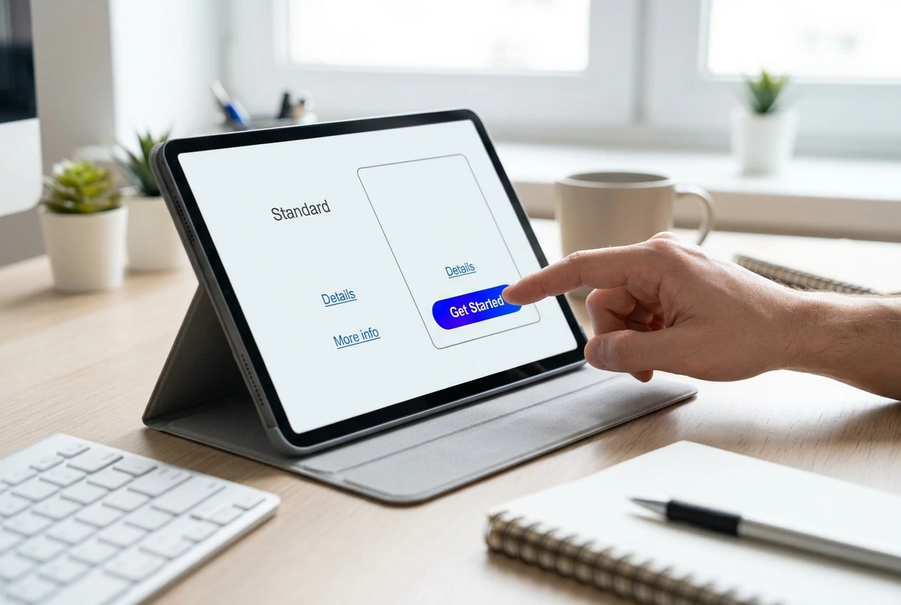
This is also why a bare text link inside a table often underperforms a clearly styled button in the same spot. The table has already done the work of narrowing the choice. A button confirms “this is the action,” while a plain link half-hidden in a cell forces the reader to go looking for what to click next, and some of them won’t bother.
If you don’t have a comparison table and your content is naturally comparative, that’s worth fixing before you fiddle with link position elsewhere. It’s one of the few structural changes that reliably moves click-through on its own.
In-line text links versus image links versus standalone buttons
Each of these three formats earns attention differently, and conflating them is where a lot of placement advice goes wrong.

-
In-line text links work best mid-content, where the reader is still reading for information and a link that extends the sentence feels natural rather than interruptive. They convert lower per-impression than buttons but get seen more often because they sit inside text the reader is already reading.
-
Image links (a product photo linked to the offer) work well right after you’ve described what the thing looks like or does, because the image answers a question the reader just formed. They underperform badly when placed with no supporting text nearby, since the reader has no reason to click an image they don’t yet understand.
-
Standalone buttons work as decision points, not reading points. They belong at the end of a section once you’ve made an argument, not in the middle of making it. A button dropped mid-argument interrupts the reasoning before the reader is convinced.
The mistake isn’t using the wrong format, it’s using the same format everywhere. A page that’s all text links or all buttons wastes the specific strength each one has.
What changes on mobile scroll behavior
Mobile readers scroll faster and scan less horizontally, since there’s no second column or sidebar competing for attention. That collapses the F-pattern into something closer to a straight vertical line, which means subheadings and the first line under them matter even more on mobile than on desktop.

It also means a link that depends on being seen alongside something else, like a sidebar call-out or a two-column comparison, often doesn’t translate to mobile at all. If a meaningful share of your traffic is on mobile, which for most affiliate content it is, check that your highest-value links aren’t sitting inside layout elements that collapse, hide, or get pushed below several screens of scrolling once the page renders on a phone.
Thumb position matters too. Buttons placed where a thumb naturally rests at the bottom of a screen get tapped more than ones requiring a reach to the top corner, which is a detail worth testing if your theme gives you that control.
Placing links by reader intent, not by position in the post
The most useful shift is to stop thinking in terms of “early,” “middle,” and “late,” and start thinking in terms of what the reader is trying to decide at each point in the post.
-
At the point where you’ve just answered “does this solve my problem,” a link lets the reader act on that answer immediately.
-
At the point where you’re comparing two or three options, a link or button on each option lets the reader choose without scrolling back up.
-
At the point where you’ve addressed the last objection or caveat, a closing link catches the reader who was close to convinced and needed exactly that reassurance.
Three links placed at those three intent points will usually outperform six links placed every few paragraphs regardless of what the reader is thinking at that moment. If you want the underlying structure for building content that creates these intent points deliberately rather than relying on them to show up naturally, how to write affiliate content that converts covers how to build a post around them from the first draft.
Testing placement changes without guessing
Repositioning links based on scan patterns is a reasonable starting point, but it’s still a hypothesis until you have numbers behind it. Change one placement at a time; if you move three links on the same post in the same week, you won’t know which change did anything.
Give each change enough traffic to produce a meaningful sample before judging it. A post that gets forty visits a week needs a month or more of data before a click-rate change means anything, not three days.
Keep a simple record of what you moved and when, even if it’s just a note in a spreadsheet: link, old position, new position, date changed. Without that, it’s easy to convince yourself a placement worked when traffic simply had a good week.
Where to go from here
Once you’ve repositioned your links based on where your readers’ attention and intent actually sit, the only way to know if it worked is to track clicks and conversions by placement rather than by page. The funnel tracking method in how to track affiliate sales through a funnel walks through setting that up so you can see which specific spot on the page is doing the work, instead of guessing from total pageviews alone.