

If you want to know how to increase landing page opt-in rate, start here: a landing page has one job, which is to get the visitor to do the one thing you put them there to do. Not read your story, not admire your design, not learn everything about your lead magnet. Opt in. Everything on the page either moves a visitor toward that action or gets in the way of it, and most pages are quietly full of things that get in the way.
Three problems sabotage opt-in rates more than any others. The page asks for too much before it has earned anything. It gives the visitor more than one decision to make. And it looks fine on a desktop monitor but falls apart on the phone screen where most of your traffic actually lands. Fix those three and you’ve fixed the page. This is a build sheet for doing exactly that, element by element.
The one job a landing page has, and the three things that quietly sabotage it
Before you touch headlines or button copy, look at the page as a whole and ask what it’s actually asking the visitor to do. If the answer takes more than one sentence, the page is asking for too much.
The three sabotage points are worth naming plainly because they show up in almost every underperforming page:
-
Too much friction. Extra form fields, extra paragraphs, extra clicks between arrival and opt-in.
-
Too many decisions. A second offer, a navigation menu, a link to the blog, anything that competes with the one action you want.
-
Too little trust, too late. Nothing on the page tells the visitor why this is safe or worth thirty seconds, until it’s buried below a fold they never scroll to.
Everything below addresses one of these three.
Headline and subheadline: what earns the next three seconds of attention
A visitor decides whether to keep reading within the first few seconds. The headline’s job isn’t to be clever. Its job is to tell the visitor, immediately, what they get and who it’s for, so the next line has something to confirm.
A headline that describes a benefit in concrete terms outperforms one that describes a feeling. “Free checklist for pricing your first affiliate offer” tells a visitor exactly what’s waiting. “Finally, clarity on pricing” tells them nothing they can act on. Specificity is what makes a headline do its job; vagueness is what makes a visitor leave.
The subheadline’s job is different from the headline’s. Where the headline states the offer, the subheadline removes the one objection most likely to stop someone from opting in. That’s often a time objection (“takes five minutes to read”) or a relevance objection (“built for affiliates with no list yet”). Write the subheadline after you know what your visitor hesitates on, not before.
Keep both short. A headline that runs two lines on mobile has already lost some of its force before the visitor finishes reading it.
Form fields: why every extra one costs you opt-ins
Every field on a form is a small decision and a small amount of friction, and friction compounds. A visitor willing to give you an email address may not be willing to also give you a first name, a phone number, and an answer to “what’s your biggest challenge.” Each additional field is a chance for them to stop.
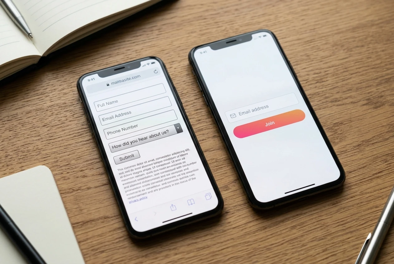
If the only thing you need to deliver the lead magnet and start the relationship is an email address, ask for only the email address. Add a name field only if you have a specific, tested reason to personalize later emails and you’re confident the extra field is worth what it costs you in opt-ins. Don’t add fields because they might be useful someday. Add them when you have a current use for the data and no way around it.
This matters more on mobile than on desktop, because typing on a phone keyboard is slower and more error-prone than typing on a physical one. A two-field form that’s mildly annoying on desktop can be the difference between an opt-in and an abandoned page on mobile.
If you’re currently running a three or four field form and opt-ins feel low, cutting it down to email-only is one of the few changes on this list you can test in under an hour and expect to see move the number.
The single call-to-action rule, and why two competing offers halve both
A landing page should offer one action. Not one primary action with a secondary link to your blog, not one offer with a second offer below it for people who “aren’t ready yet.” One action, repeated as many times as the page needs it, never varied.
The reasoning is simple: every additional choice you give a visitor reduces the odds they take any single one of them. This isn’t a matter of taste, it’s a matter of attention. A visitor who has to decide between opting in now, reading more first, or checking out a related offer, is a visitor who has three things to think about instead of one. Most will resolve that by doing nothing at all.
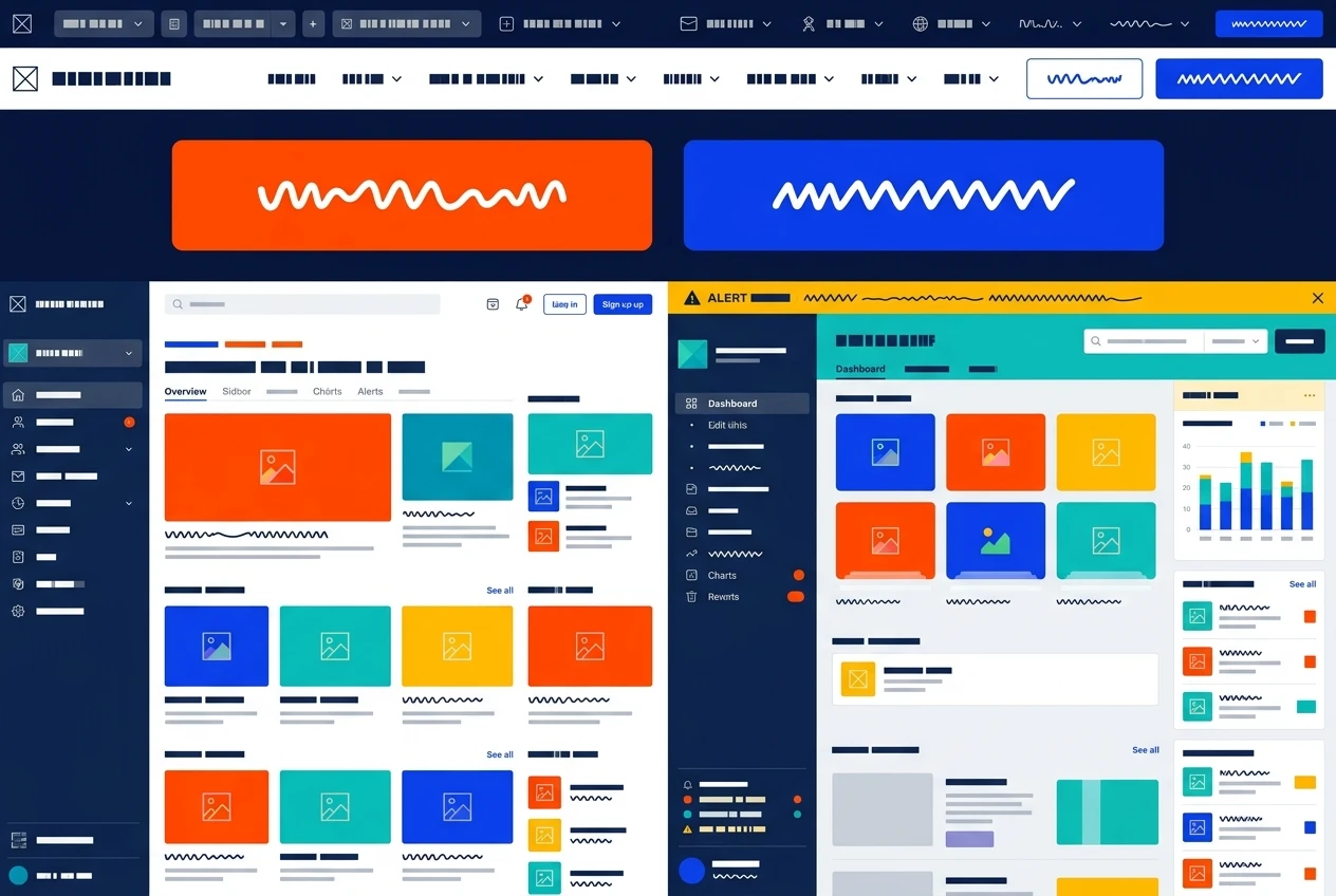
This means:
-
No navigation menu that lets visitors wander away from the page.
-
No second offer “in case this one isn’t for you.”
-
No link to your homepage, your about page, or your social profiles.
-
The button text should describe the same action every time it appears on the page, not a different phrase each time for variety.
If you want to test two different lead magnets or two different angles, that’s a job for two separate landing pages, not one page with two buttons. Run them separately and compare. A page with two competing calls to action doesn’t give you two chances to convert; it gives you one chance split in half.
Trust signals that work before you have testimonials or case studies
Most advice about trust signals assumes you already have testimonials, reviews, or a case study to show. If you’re early, you don’t have those yet, and that’s fine. There are trust signals that don’t depend on social proof.
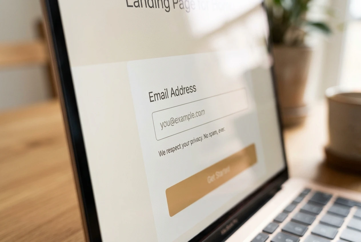
A privacy line near the form, something as simple as a statement that the email address won’t be sold or spammed, removes a specific and common hesitation at the exact moment the visitor is deciding whether to type. It costs you one short sentence and it addresses a real objection directly.
Specificity itself functions as a trust signal. A lead magnet described in vague terms (“a free guide to affiliate success”) reads as generic and faintly suspicious. A lead magnet described specifically (“a 12-point checklist you can run through in one sitting”) reads as something a real person built for a real reason. Precision is one of the few trust signals available to you before you have reviews.
A clear, professional, uncluttered page design functions as a trust signal too, even though no visitor would describe it that way consciously. A page that looks rushed, with mismatched fonts and stock photography that doesn’t fit, quietly tells the visitor that what’s behind the opt-in might be just as rushed.
Place whatever trust signal you use near the form itself, not in a footer the visitor may never scroll to. The objection it’s answering shows up at the point of decision, so the answer needs to be there too.
Mobile layout checks to run before you publish

Most of your traffic is probably arriving on a phone, which means the mobile version of your page isn’t a secondary concern, it’s the primary one. Run these checks on an actual phone, not a resized browser window, before you publish anything:
-
The headline fits without wrapping into three or four lines that push the form below the visible screen.
-
The form field and the button are both large enough to tap accurately with a thumb, with space around them so a visitor doesn’t hit the wrong element.
-
The page loads fast. A slow-loading image above the form will cost you visitors who never see the offer at all.
-
Nothing requires horizontal scrolling or pinching to zoom.
-
The button is visible without scrolling, or very close to it. If a visitor has to hunt for the way to act, some won’t.
None of this requires design skill. It requires opening the page on your own phone and trying to opt in the way a stranger would, with no prior knowledge of what the page is for.
What to test first when opt-ins stall
If opt-ins have stalled and you’re not sure why, test in this order, because each one is cheaper to change and more likely to move the number than the one after it:
-
Form length. Cut to email-only if you haven’t already.
-
Headline. Rewrite it to state the specific benefit instead of a general promise.
-
Call-to-action count. Remove any competing offer, link, or menu item on the page.
-
Trust line placement. Move it next to the form if it’s currently buried elsewhere.
-
Mobile layout. Fix anything that forces scrolling, zooming, or hunting for the button.
Change one thing at a time where you can, so you know what actually moved the number rather than guessing. And keep in mind that a landing page can be structured perfectly and still underperform if the thing behind it isn’t worth opting in for. If you haven’t already built the lead magnet itself with the same attention you’re now giving the page, that’s the next piece worth getting right. Building a Lead Magnet That Actually Gets Opened covers how to make the offer behind this page one people actually want.