

Most affiliate marketers test their landing page on the screen in front of them, approve it, and move on. That screen is almost always a laptop. The page converts well there, the numbers look healthy in aggregate, and the gap between desktop and mobile sits quietly inside the average until someone finally splits the report by device. That is usually the moment the problem becomes visible, and by then the page has been live for weeks or months, sending half its traffic through a version of itself nobody actually checked.
This piece is about mobile landing page optimization for affiliate marketing specifically: the technical and layout reasons a page that earns clicks on a desktop screen loses them on a phone. It is not about swapping headlines or redesigning your opt-in box. If you want that ground, the landing page elements that move opt-in rate is already covered elsewhere on the Hub. This is about why the same elements behave differently once a thumb and a 6-inch screen are doing the work a mouse and a 24-inch monitor used to do.
Why your desktop winner can quietly fail on mobile
A desktop visitor scans with their eyes and clicks with precision. A mobile visitor scrolls with a thumb, reads in short bursts between distractions, and taps with a fingertip that covers far more area than a cursor arrow. Those are different physical acts, not a smaller version of the same one.

A button that sits comfortably below the fold on a laptop screen might sit three full scrolls down on a phone, because the same content stacks vertically instead of filling a wide layout. A form that takes four seconds to fill on a keyboard can take forty seconds on a touch keyboard that keeps autocorrecting an email address. None of this shows up when you preview the page on your own computer by shrinking the browser window, because a shrunk browser window is not a phone. It still has your mouse, your processor, your home broadband connection. Your actual mobile visitor has none of those.
This is why a page can post a strong overall conversion rate while badly underperforming on mobile specifically. The desktop number is carrying the average. Once you split the report by device, which the fifth section of this piece gets into, the real story usually shows up fast.
The load speed threshold where mobile visitors actually leave
Desktop visitors on a broadband connection are patient in a way mobile visitors on cellular data are not. A page that loads in two seconds on your office wifi can take five or six seconds on a phone connection, and that difference changes behaviour, not just mood. Industry data on mobile page abandonment consistently shows bounce rate climbing sharply once load time crosses the three-second mark, and continuing to climb from there. By the time a page takes five seconds to become usable, a large share of visitors have already left before your headline rendered.
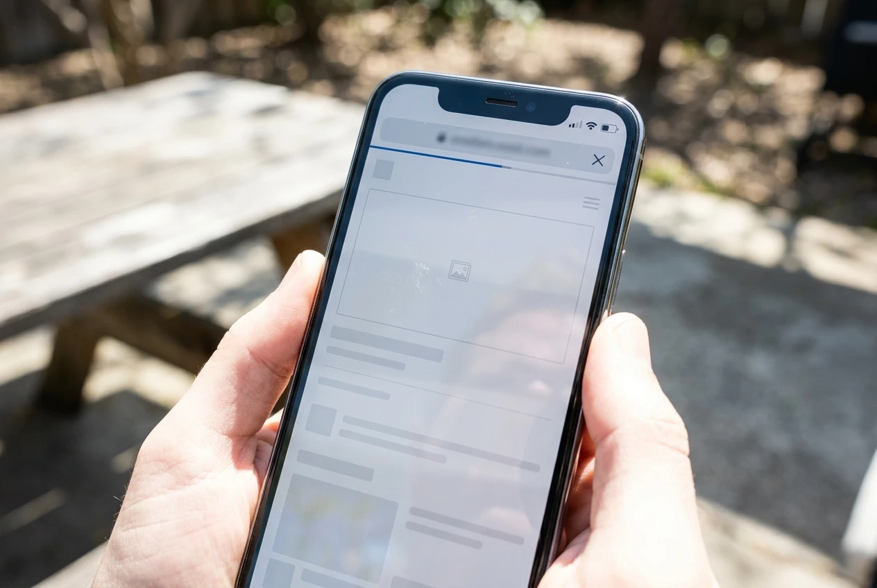
The specific number that matters most is not total load time but time to the first interactive element, the point where a visitor could actually tap something even if images are still loading. A hero image that is several megabytes because nobody compressed it will delay that moment every time, regardless of how fast your hosting is otherwise. If your Hub’s sites sit on hosting that was never built with affiliate traffic patterns in mind, the gap between a desktop page and an optimised mobile page gets wider under load, which the comparison in WP Engine vs SiteGround for affiliate sites deals with in more depth.
Check your actual load time on a real mid-range phone over cellular data, not wifi, before assuming your page is fast enough. A page that feels instant on your desk can be the reason half your mobile traffic never sees your offer.
Designing for thumbs: button placement, tap targets and one handed scrolling
Most phones are held in one hand with the thumb doing all the work. That thumb comfortably reaches the bottom two-thirds of the screen and struggles with the top, which is the opposite of how most desktop-first layouts are built, with the primary call to action sitting high and the page unfolding downward from there.
A tap target that is comfortable for a mouse cursor, roughly the size of a text link, is frequently too small for a thumb. Apple and Google’s own design guidelines put a minimum comfortable touch target at around 44 to 48 pixels square. Buttons smaller than that get missed, tapped twice, or tapped next to, which sends the visitor to the wrong link or nowhere at all. Check your call-to-action button’s actual rendered size on a phone screen, not its size in your page builder’s desktop preview.
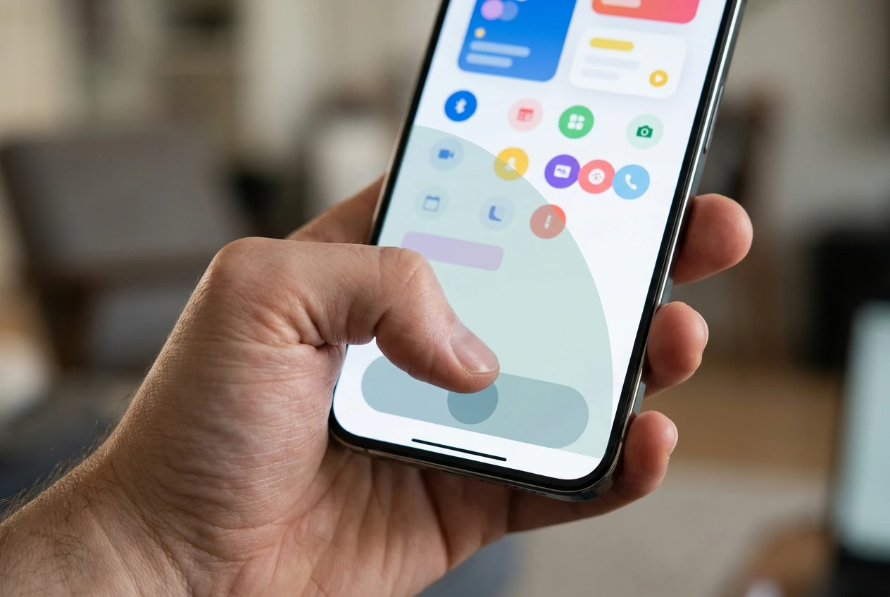
Spacing matters as much as size. Two links sitting close together with a thumb-sized gap between them will still produce mistaken taps, because a fingertip covers more area than the visual boundary of the link itself. Give your primary button room on all sides, and avoid stacking a secondary link directly beneath it where a slightly low tap lands on the wrong one.
Scrolling behaviour matters too. A page that requires horizontal scrolling or careful zooming to read body text is a page built for a screen that isn’t the one in front of the visitor. Text should be legible at the default zoom level, and the page should scroll in one direction only. Any design element that interrupts smooth vertical scrolling, a sticky element that jumps or a carousel that requires a precise swipe, adds friction a desktop test will never surface.
Forms, pop-ups and interstitials that cost you the tap

A form field that autofocuses the moment the page loads, before the visitor has read anything, triggers the on-screen keyboard immediately and covers half the screen with it. On desktop this is mildly annoying. On mobile it can hide your offer entirely, leaving the visitor staring at a keyboard with no context for why they’re being asked to type.
Pop-ups are worse on mobile than desktop for a simple reason: there is often no visible, easy-to-tap close button, because the X was designed at a size that worked for a cursor. A visitor who can’t close an interstitial quickly closes the tab instead. Google has penalised intrusive mobile interstitials in search rankings for this exact reason, which means a page that still runs a full-screen pop-up on mobile may be losing both organic visibility and on-page conversions at the same time.
Form length matters more on mobile because every additional field means another round of tapping into a cramped on-screen keyboard, often with autocorrect fighting the input. A form that asks for name, email, and phone number on desktop may be costing you completions on mobile that a simpler email-only version would not. Test whether a field can be removed, not whether it can be justified.
Reading your mobile numbers apart from desktop before you change anything
Before changing a single element, split your analytics by device and look at mobile conversion rate on its own, separate from the blended number. Most analytics platforms make this a simple segment or filter, and it takes a few minutes to set up if it isn’t already part of your regular reporting.
Look specifically at where mobile visitors drop off relative to desktop visitors on the same page. If the drop happens at the page load, before any content has rendered, the problem is speed. If the drop happens after the page is visible but before the form is completed, the problem is more likely layout, tap targets, or an interstitial getting in the way. If mobile visitors reach the form but abandon it partway through, the number of fields is worth testing before anything else on the page.
This split matters because the fixes for each of these problems are different, and applying a speed fix to a layout problem, or a layout fix to a form problem, wastes time without moving the number. Treat the device split as the diagnosis step, not an optional extra once the obvious fixes are done.
Tools that show you what a phone visitor actually experiences
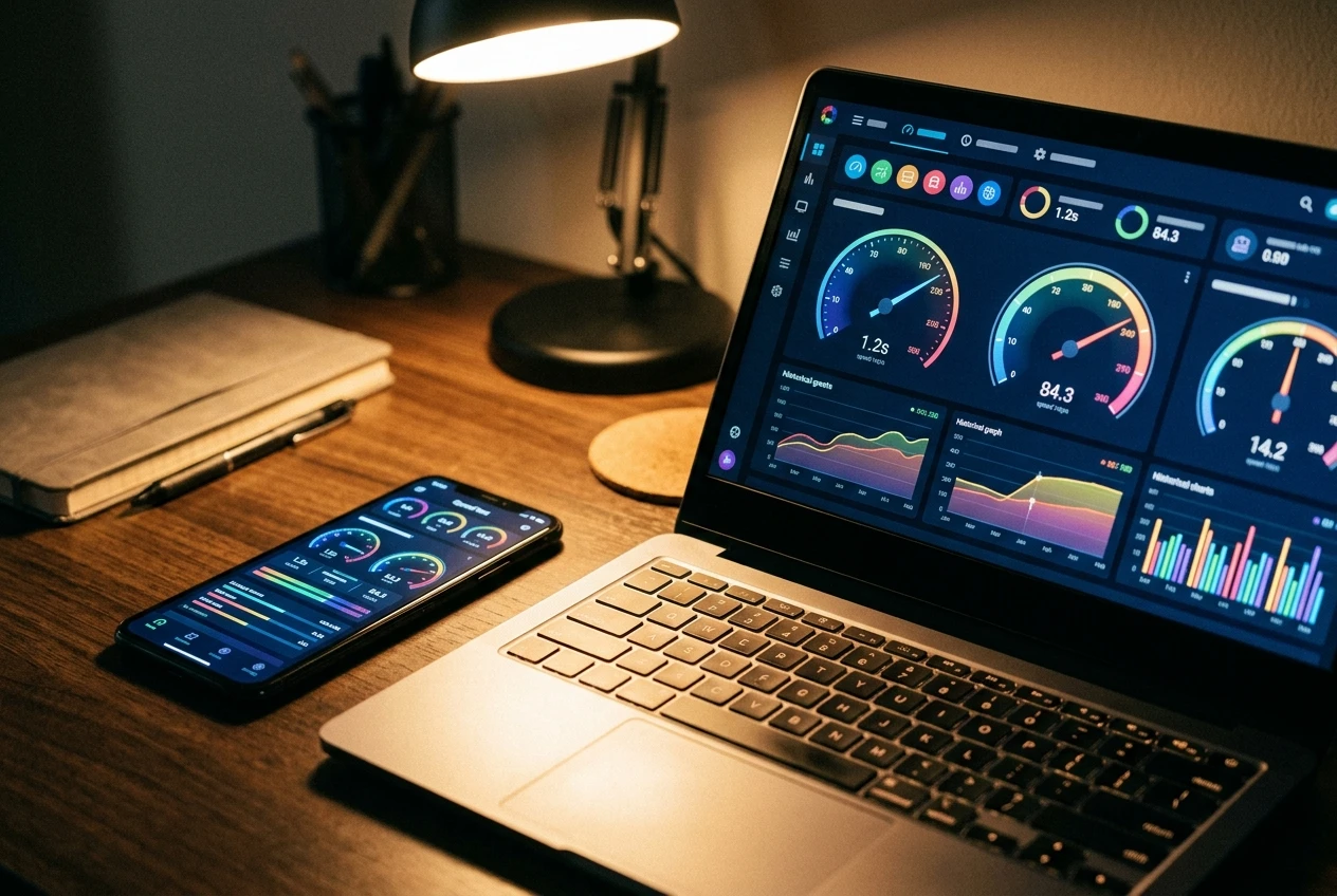
Guessing what a phone visitor sees from a desktop preview is the habit this whole piece is arguing against, so the fix is to look at the real thing. Google’s PageSpeed Insights and Lighthouse both report mobile load time and time to interactive separately from desktop, using a simulated mid-range phone and a throttled connection rather than your office wifi, which gets much closer to what a real visitor experiences.
Screen recording tools built for mobile, the kind that capture an actual visitor’s taps, scrolls, and hesitations on their own device, show you exactly where a thumb missed a button or where someone gave up scrolling. These are worth more than a guess based on how the page looks in your hand, because your hand already knows where the buttons are.
Browser developer tools also let you throttle your own connection speed to simulate a 3G or slow 4G network while testing on a real phone, which is a fast way to see your page the way a visitor on patchy cellular data sees it. None of these tools require a subscription to get useful information out of them, and running your page through even one of them before changing anything tells you more than another round of desktop testing ever will.
Pull up your own analytics and compare mobile conversion rate against desktop for your current landing page before changing a single element, so you know which of these fixes actually applies to you.